
In the previous steps we learned the basics of how to render components and attributes in a block. In this step we’ll focus on what WordPress (at least in code) calls Inspector: the sidebar on the right hand side in the editor. We’ll touch upon some new components that make sense to place in the sidebar and how to handle these.
Inspector/sidebar component
For inserting your custom settings and HTML into the Inspector sidebar, you will wrap everything inside a component called InspectorControls. Whatever you put inside this component will be output in the sidebar and not inside the block/editor itself. You can basically put the component and its content everywhere in the return of the edit function.
Apart from that you’d handle settings inside the sidebar as they were inside the block. Each setting requires an attribute, and you load and update the attributes the same way.
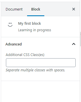
Let’s first take a quick look at how our block’s sidebar looks like (when our block is active in the editor), based on the code we ended up in the previous step.
All blocks will as default show the block’s icon, name and description, and the section Advanced – collapsed. Inside Advanced you’ll find a text input for providing CSS class for the block.
Adding a sidebar section and some settings
The sidebar is divided up in sections (referred to as panels in code), and for optimal design and functionality (including the open-collapse functionality) we should use WordPress’ components for outputting panels properly.
Use the component PanelBody for adding a section (the ones that you can open or collapse), found in the wp.components package. The component accepts a few props, for example for the title and whether or not the panel should be open or closed as default. You can also provide custom class, icon, and attach an event function onto the open-close trigger.
Within PanelBody WordPress then recommends using the PanelRow component which acts like generic containers within the panel – to ensure streamlining the design. This component automatically applies some margin and flex row styling for your contents. Because of the “flex-direction: row” styling you should wrap each setting inside one PanelRow. Or you can skip it altogether and take responsibility for styling it yourself with divs and such.
Adding a panel and settings
Let’s add a sidebar panel for our block with a few settings inside, just to see it in practice. We’ll add a toggle control, a select input, a colorpicker and a checkbox – just to get some experience with different types of input components. I’ve left the block content (with the two RichTexts) and the save function just like before.
const { registerBlockType } = wp.blocks;
const { RichText, InspectorControls } = wp.blockEditor;
const { ToggleControl, PanelBody, PanelRow, CheckboxControl, SelectControl, ColorPicker } = wp.components;

registerBlockType('awp/firstblock', {
	title: 'My first block',
	category: 'common',
	icon: 'smiley',
	description: 'Learning in progress',
	keywords: ['example', 'test'],
	attributes: {
		myRichHeading: {
			type: 'string',
		},
		myRichText: {
			type: 'string',
			source: 'html',
			selector: 'p'
		},
		toggle: {
			type: 'boolean',
			default: true
		},
		favoriteAnimal: {
			type: 'string',
			default: 'dogs'
		},
		favoriteColor: {
			type: 'string',
			default: '#DDDDDD'
		},
		activateLasers: {
			type: 'boolean',
			default: false
		}
	},
	edit: (props) => {
		const { attributes, setAttributes } = props;
		return (
			<div>
				<InspectorControls>
					<PanelBody
						title="Most awesome settings ever"
						initialOpen={true}
					>
						<PanelRow>
							<ToggleControl
								label="Toggle me"
								checked={attributes.toggle}
								onChange={(newval) => setAttributes({ toggle: newval })}
							/>
						</PanelRow>
						<PanelRow>
							<SelectControl
								label="What's your favorite animal?"
								value={attributes.favoriteAnimal}
								options={[
									{label: "Dogs", value: 'dogs'},
									{label: "Cats", value: 'cats'},
									{label: "Something else", value: 'weird_one'},
								]}
								onChange={(newval) => setAttributes({ favoriteAnimal: newval })}
							/>
						</PanelRow>
						<PanelRow>
							<ColorPicker
								color={attributes.favoriteColor}
								onChangeComplete={(newval) => setAttributes({ favoriteColor: newval.hex })}
								disableAlpha
							/>
						</PanelRow>
						<PanelRow>
							<CheckboxControl
								label="Activate lasers?"
								checked={attributes.activateLasers}
								onChange={(newval) => setAttributes({ activateLasers: newval })}
							/>
						</PanelRow>
					</PanelBody>
				</InspectorControls>
				<RichText
					tagName="h2"
					placeholder="Write your heading here"
					value={attributes.myRichHeading}
					onChange={(newtext) => setAttributes({ myRichHeading: newtext })}
				/>
				<RichText
					tagName="p"
					placeholder="Write your paragraph here"
					value={attributes.myRichText}
					onChange={(newtext) => setAttributes({ myRichText: newtext })}
				/>
			</div>
		);
	},
	save: (props) => {
		const { attributes } = props;
		return (
			<div>
				<RichText.Content
					tagName="h2"
					value={attributes.myRichHeading}
				/>
				<RichText.Content
					tagName="p"
					value={attributes.myRichText}
				/>
			</div>
		);
	}
});
As always we start by destructuring the components and function we want to use. In attributes inside registerBlockType() we define one attribute per input and match the type – for example the toggle control expects a boolean and because the values of the dropdown are strings that attribute should be a type string as well.
At line #41 we start the InspectorControls component, and everything from that point until line #80 will appear in the sidebar. The rest will appear inside the editor itself, and I’ve made no changes there.
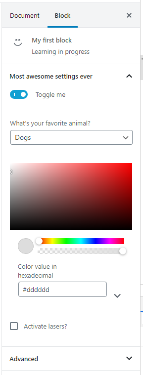
Inside we first create a panel with PanelBody and with the prop initialOpen set to true we tell Gutenberg that this panel should be opened by default. And then it’s up to us what to add inside each PanelRow.
For the component ToggleControl we use the same props as we’ve done before with text inputs, except that instead of the prop value we provide the attribute value inside the prop checked. This applies to any inputs that expects a checked attribute in plain HTML, for example checkboxes. For radio buttons you’d use the prop selected as this is what you’d use in plain HTML as well. Keep in mind that the attribute for this input must be of type boolean.
As for the CheckboxControl when handling a singular checkbox works exactly the same as ToggleControl – it returns a boolean whether or not it’s checked.
The SelectControl generates a select dropdown and expects the possible choices as an array in the prop options. Each element must be an object with the properties label and value. The same applies for checkboxes and radio buttons (RadioControl). In normal circumstances you’d probably generate the choices as a variable outside the HTML output.
You might notice that the ColorPicker works a little different than the others as this is a more complex component and not a standard HTML input. Provide the prop color for the saved color, and instead of onChange (fires once when clicking but also every time the value is changed while dragging – which can result in a lot of fires) use onChangeComplete. The prop returned in this event is also an object where we need to decide which part we want to save in our attribute. In this example we want to save the hex value (without alpha/opacity), so inside setAttributes() we extract the hex property of the color object returned. This is also why we add the property disableAlpha as to remove the alpha channel UI (for controlling the opacity) since it makes no sense to offer the user this when we never save the opacity value.
Each of the component has a label prop available except the colorpicker. If you want to output a label or text before it you’ll need to fiddle around with HTML or styling to ensure it looks good.
You can obviously add as many panels as you want, just add another PanelBody component after the previous one.
Handling save
I have left the save function as it was before. It’s up to you and it all depends on what the settings control in the output. You already know how to get the values of each setting. As an example let’s assume that the boolean attribute activateLasers control whether or not a custom HTML element rendered. If the attribute’s true a div should be output, otherwise not. You could do it with traditional if-check or use JSX’s inline if and && operator. Read more about this in React’s guide for conditional rendering.
save: (props) => {
	const { attributes } = props;
	return (
		<div>
			<RichText.Content
				tagName="h2"
				value={attributes.myRichHeading}
			/>
			<RichText.Content
				tagName="p"
				value={attributes.myRichText}
			/>
			{attributes.activateLasers &&
				<div className="lasers">Lasers activated</div>
			}
		</div>
	);
}
Because we use RichText this output would not be visible in the editor, but it will appear in frontend.
You’ll find more components in the wp.components Github repo. Most of these folders should provide you a readme with some documentation on how to use it. I learned most of this by looking in this repo and also on core WordPress components how they did it.
In the next step in the series we’ll focus on how to control the block’s toolbar. We’ll learn how to handle for example a block’s alignment and add custom buttons to the toolbar.