
This post is for you who’s creating a custom Gutenberg block and need a way to select or upload an image from the Media Library. Most other field types, such as checkboxes, text inputs, or colorpickers, are pretty easy to add but a Media uploader requires a bit more code. We will create a Inspector component that is responsible for rendering a button for opening up Media Library, selecting an image, and optionally remove or change it at a later time. All using standard WordPress components.
Before we dive into the code, please keep in mind that this post requires some Gutenberg knowledge in how to write custom blocks. We will focus only on the media uploader part and not how to register and make a Gutenberg block in itself. If you are unsure about how to write a custom Gutenberg block I have a tutorial series covering exactly this:
With that out of the way, let’s dive right in!
What we will make
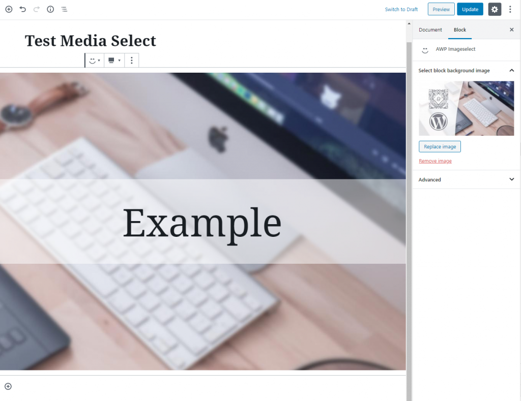
The select media function will functionally be exactly the same as WordPress’ featured image function. We will inside Inspector add a panel that consist of a button to choose an image.
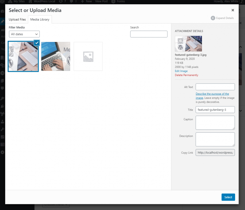
When clicking on the button the “Select or Upload Media” window will pop up allowing you to select a file from Media Library. We limit the Media Library to show images only. Once an image is selected, the popup closes and the panel previews a small thumbnail of the selected image. Below the preview buttons for changing and removing the image will appear. Exactly like with featured image.
This tutorial assumes you will use the selected image as the block’s background – just as an example. This is why we store the image’s URL. I’ll include an example on how to use the selected image (both in the edit and in the save function). When choosing an image, the image will appear as background to our block, both inside the editor and in frontend.
We store the media ID and media URL in the block’s attributes. The code uses withSelect, a higher-order-component provided in wp.data package, to query more information about the selected media, by ID.
I am also “borrowing” class names from WordPress’ featured image functionality to ensure that everything looks good and there’s no need to write any CSS yourself. This is of course optional.
Saving the selected media in attributes
What you need to save in your block’s attributes is a little up to you. As minimum we need to store the media ID, obviously. This might be enough if you don’t need to use the media’s URL anywhere in the script code. For example if you use ServerSideRender where PHP is responsible for rendering the block’s output. In that case you can easily get the image URL from media ID using for example wp_get_attachment_image_src(). However in the example below I’m showing a simple example of displaying the image as background to our block, so I also store the media URL as attribute. We will use the URL attribute in both edit (to add the background in editor) and in save (to add the background in frontend).
Let’s start by defining our attributes. Media ID should be type number and default to 0. This makes it easy to compare against. And media URL should be type string with default empty string.
attributes: {
	mediaId: {
		type: 'number',
		default: 0
	},
	mediaUrl: {
		type: 'string',
		default: ''
	}
},
Creating the component
To make our code more orderly we define a separate component for the block’s edit function. We will later on pass this component to withSelect as to wrap it around our component.
In the component’s return we render a simple <div> for the block content. I assume you will or have more actual block content to replace the dummy example content. We also render InspectorControls (package wp.blockEditor) in order to add a section to the inspector. For now I add an empty PanelBody inside the InspectorControls. I add a <div> with the same class as WordPress’ featured image section uses. This makes sure our styling looks good. Later on we will fill this PanelBody with the code for the select media functionality.
But first, let’s destructure the necessary component at the start of the file:
const { InspectorControls } = wp.blockEditor;
const { PanelBody } = wp.components;
const { Fragment } = wp.element;
Above the registerBlockType I define a simple component called BlockEdit. If you prefer to move this into a separate file, you are welcome to do so. This is common and recommended, but for this tutorial I’m keeping things simple and keep it in the same file.
const BlockEdit = (props) => {
	const { attributes, setAttributes } = props;

	return (
		<Fragment>
			<InspectorControls>
				<PanelBody
					title={__('Select block background image', 'awp')}
					initialOpen={ true }
				>
					<div className="editor-post-featured-image">
						...We will add code here...
					</div>
				</PanelBody>
			</InspectorControls>
			<div>
				... Your block content here...
			</div>
		</Fragment>
	);
};
Now we want to render this component in our edit function. But we want to wrap it in a withSelect.
Using withSelect in the edit function
If you are not familiar with withSelect, it’s a useful higher-order-component that allows us to perform queries. You can for example query posts with this. We will however use the function select('core').getMedia() to query the media ID. As response we will get an object with all of the media’s information. The media object we get in response will then be provided as prop in our BlockEdit component, ready to use. Nifty.
We make sure to only query the media if the media ID attribute actually is set to something other than 0. This is how our edit function will look like:
edit: withSelect((select, props) => {
	return { media: props.attributes.mediaId ? select('core').getMedia(props.attributes.mediaId) : undefined };
})(BlockEdit),
At the very end, after closing withSelect in line #3 is where we ask withSelect to return our BlockEdit component. With this our BlockEdit component now have access to props.media.
Rendering a media select
Finally comes the fun part: The part in the Inspector.
The component we’re interested in is MediaUpload (package wp.blockEditor). If you’re interested WordPress Github repo for Gutenberg has some documentation on this component. We will also wrap this component inside a component called MediaUploadCheck (package wp.blockEditor). This component is making sure that the current user has capabilities to use the Media Library, so it’s good practice to use this.
The MediaUpload component has a required prop: render. The way this component works is that we define a function for the render prop where we render the output for the “media uploader area”. In our case we will render a Button (package wp.components). Inside MediaUpload’s render prop we get access to the open function which we can call to make WordPress open up the Media Library popup:
There’s a few more props available for MediaUpload. We’ll cover the important ones to make it functional in this tutorial, but there are a few more you can play with. You might at the very least be interested in the prop allowedTypes where you can limit what filetypes are possible to select in the Library. In our case we set it to only allow images.
Adding the MediaUpload
Destructure the new components first;
const { Button } = wp.components;
const { MediaUpload, MediaUploadCheck } = wp.blockEditor;
Let’s add MediaUploadCheck and MediaUpload inside our div in our PanelBody:
<div className="editor-post-featured-image">
	<MediaUploadCheck>
	    <MediaUpload
	        allowedTypes={ ['image'] }
	        render={({open}) => (
	            <Button
	            	className={attributes.mediaId == 0 ? 'editor-post-featured-image__toggle' : 'editor-post-featured-image__preview'}
	            	onClick={open}
	            >
	            	{attributes.mediaId == 0 && __('Choose an image', 'awp')}
	            </Button>
	        )}
	    />
	</MediaUploadCheck>
</div>
The code above destructure open inside the function for render. We render a simple Button where its onClick property will run the open function. I’ve also added the same class names as WordPress’ featured image functionality to ensure we don’t need to add any styling.
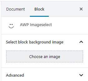
Inside the Button component we check whether or not an image has been set (attributes.mediaId). If it hasn’t we echo the text “Choose an image”. We should now get this in our block.
When you click the button the Media Library popup should appear. However selecting an image does not work as of right now, because we’re missing the onSelect and value props on MediaUpload. Let’s fix that now. We set value to the selected media ID, and we set onSelect to run a function we will later define inside our component.
...
<MediaUploadCheck>
	<MediaUpload
		onSelect={onSelectMedia}
		value={attributes.mediaId}
		allowedTypes={ ['image'] }
		...
Let’s define the onSelectMedia function within our component.
Handling selecting media
Right before the component’s return statement I define an onSelectMedia function. All we need is to do is update our attributes using setAttributes(). As parameter to onSelectMedia we get a media object. We simply extract what we need from the media object. In our case it’s the media ID and the full size URL, which are the properties id and url respectively.
const BlockEdit = (props) => {
	const { attributes, setAttributes } = props;

	const onSelectMedia = (media) => {
		props.setAttributes({
			mediaId: media.id,
			mediaUrl: media.url
		});
	}

	return(
		...
Try it now and you will now be able to select an image from the Media Library. The selected media gets saved in the block’s attributes. However there’s no preview of it in the Inspector yet, and because you’ve selected an image the button for selecting an image disappears. The panel is now empty. The next step is rendering the preview whenever an image has been selected as well as providing options to remove or change it.
Rendering a preview image
Inside the Button component we render inside MediaUpload‘s render prop we echo a text “Choose an image” if an image is not yet set. But we need to add some code for when an image is set inside here; a preview.
To help us render a nice preview we use the component ResponsiveWrapper (package wp.components). In order to make ResponsiveWrapper fully function we need to provide props for the height and width. We also need the thumbnail URL. There’s no point using the full URL (which can be gigantic) to render a preview inside the Inspector. This is where the prop from withSelect comes in. Inside the component we render a simple <img> HTML tag.
First we destructure the necessary component:
const { ResponsiveWrapper } = wp.components;
<Button
	className={attributes.mediaId == 0 ? 'editor-post-featured-image__toggle' : 'editor-post-featured-image__preview'}
	onClick={open}
>
	{attributes.mediaId == 0 && __('Choose an image', 'awp')}
	{props.media != undefined &&
		<ResponsiveWrapper
    			naturalWidth={ props.media.media_details.width }
			naturalHeight={ props.media.media_details.height }
    		>
    			<img src={props.media.source_url} />
    		</ResponsiveWrapper>
	}
</Button>
As you can see we access the prop the withSelect component provided us, props.media. We fetch the width, height, and url to the media’s thumbnail size from the object.
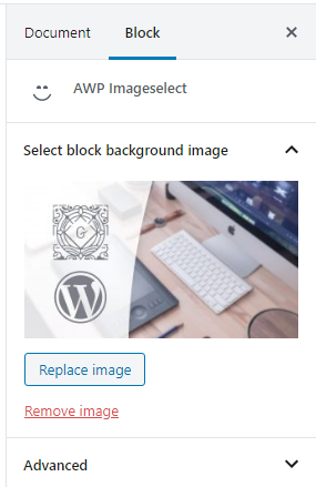
You should now get a nice preview of the selected image!
Because we render the preview image inside the Button clicking on the preview image will trigger the Button‘s onClick function – which is to open the Media Library. That way you can already change the selected image.
Currently there’s not way to remove or reset the selected image. Let’s fix that!
Adding a remove function
We should at the very least offer the possibility for the user to remove the selected image. As of right now once you’ve selected an image you can only change it, but not remove it.
We’ll do it the same as WordPress does for featured image: A new Button below the preview image (entirely outside its MediaUploadCheck). By providing some clever props to the Button we make it look like a link (isLink) with red text color (isDestructive). Read the documentation for Button to see what else is possible. We wrap the button inside yet another MediaUploadCheck, just to ensure the user has the right capabilities.
		...
		</MediaUploadCheck>
		{attributes.mediaId != 0 &&
			<MediaUploadCheck>
				<Button onClick={removeMedia} isLink isDestructive>{__('Remove image', 'awp')}</Button>
			</MediaUploadCheck>
		}
	</div>
</PanelBody>
For this Button‘s onClick event we run a new function inside our component: removeMedia(). We define it somewhere right before the component’s return function, like we did with onSelectMedia.
const removeMedia = () => {
	props.setAttributes({
		mediaId: 0,
		mediaUrl: ''
	});
}
All this function does is to reset our two attribute values.
We will now have a nice, clear link to remove the image:
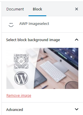
When you click on the new button, the selected image and the button itself disappears, and the button for selecting an image appears again.
Adding a replace button
This step is fully optional. As mentioned earlier, clicking on the image’s preview image will open Media Library and allowing you to change the image. However this might not be as intuitive for everyone to understand. WordPress adds a separate button for changing the image, just to make it very clear. We can do the same.
To render a change image button we basically repeat the code we have for selecting the image: another MediaUpload component. We provide the same function for onSelect, allowedFileTypes and value as before. Inside the render prop for MediaUpload we simply render another Button that opens the Media Library. Let’s place this button before the Remove button – as this makes more sense for the end user:
</MediaUploadCheck>
{attributes.mediaId != 0 &&
	<MediaUploadCheck>
		<MediaUpload
			title={__('Replace image', 'awp')}
			value={attributes.mediaId}
			onSelect={onSelectMedia}
			allowedTypes={['image']}
			render={({open}) => (
				<Button onClick={open} isDefault isLarge>{__('Replace image', 'awp')}</Button>
			)}
		/>
	</MediaUploadCheck>
}
{attributes.mediaId != 0 &&
	<MediaUploadCheck>
		<Button onClick={removeMedia} ...
So now you should get this:
Using the selected image
By now it should be pretty clear how you can use the selected image. You have the media ID and media URL stored in your block’s attributes. However as a simple example I’ll include some code that sets the selected image as the block’s background. The code can be done exactly the same in both the edit and the save functions. We simply create a style object that we apply on the block’s wrapping div. In the style object we set background image to the media URL.
	...
	const blockStyle = {
		backgroundImage: attributes.mediaUrl != 0 ? 'url("' + attributes.mediaUrl + '")' : 'none'
	};

	return(
		<Fragment>
			<InspectorControls>
			...
			</InspectorControls>
			<div style={blockStyle}>
				... Your block content here...
			</div>
		</Fragment>
		...
With the rest of your custom block content it could easily look something like this:
If you apply the block style in both edit and save, your block should now get the selected media as background. Both inside the editor and in frontend.
Conclusion
Selecting an image (or file) from the Media Library is a function that you as a Gutenberg developer will no doubt need for your blocks. We’ve learned how to add a function for selecting an image from the Media Library in our custom Gutenberg block. We’ve done it the same way as WordPress itself does it for the featured image. (Edit May 2020: WordPress has now updated featured image to use useSelect, the React hook instead). This makes sure our code isn’t “hack-ish” with a high risk of breaking in future updates.
Let me know if you have had any use of this!
Full code
Below is the full code for a custom block that features the select media functionality. And nothing else really. That part is up to you!
const { registerBlockType } = wp.blocks;
const { InspectorControls, MediaUpload, MediaUploadCheck } = wp.blockEditor;
const { PanelBody, Button, ResponsiveWrapper } = wp.components;
const { Fragment } = wp.element;
const { withSelect } = wp.data;
const { __ } = wp.i18n;

const BlockEdit = (props) => {
	const { attributes, setAttributes } = props;

	const removeMedia = () => {
		props.setAttributes({
			mediaId: 0,
			mediaUrl: ''
		});
	}

 	const onSelectMedia = (media) => {
		props.setAttributes({
			mediaId: media.id,
			mediaUrl: media.url
		});
	}

	const blockStyle = {
		backgroundImage: attributes.mediaUrl != '' ? 'url("' + attributes.mediaUrl + '")' : 'none'
	};

	return (
		<Fragment>
			<InspectorControls>
				<PanelBody
					title={__('Select block background image', 'awp')}
					initialOpen={ true }
				>
					<div className="editor-post-featured-image">
						<MediaUploadCheck>
							<MediaUpload
								onSelect={onSelectMedia}
								value={attributes.mediaId}
								allowedTypes={ ['image'] }
								render={({open}) => (
									<Button
										className={attributes.mediaId == 0 ? 'editor-post-featured-image__toggle' : 'editor-post-featured-image__preview'}
										onClick={open}
									>
										{attributes.mediaId == 0 && __('Choose an image', 'awp')}
										{props.media != undefined &&
						            			<ResponsiveWrapper
									    		naturalWidth={ props.media.media_details.width }
											naturalHeight={ props.media.media_details.height }
									    	>
									    		<img src={props.media.source_url} />
									    	</ResponsiveWrapper>
						            		}
									</Button>
								)}
							/>
						</MediaUploadCheck>
						{attributes.mediaId != 0 &&
							<MediaUploadCheck>
								<MediaUpload
									title={__('Replace image', 'awp')}
									value={attributes.mediaId}
									onSelect={onSelectMedia}
									allowedTypes={['image']}
									render={({open}) => (
										<Button onClick={open} isDefault isLarge>{__('Replace image', 'awp')}</Button>
									)}
								/>
							</MediaUploadCheck>
						}
						{attributes.mediaId != 0 &&
							<MediaUploadCheck>
								<Button onClick={removeMedia} isLink isDestructive>{__('Remove image', 'awp')}</Button>
							</MediaUploadCheck>
						}
					</div>
				</PanelBody>
			</InspectorControls>
			<div style={blockStyle}>
				... Your block content here...
			</div>
		</Fragment>
	);
};


registerBlockType('awp/imageselectinspector', {
	title: 'AWP Imageselect',
	icon: 'smiley',
	category: 'layout',
	supports: {
		align: true
	},
	attributes: {
		mediaId: {
			type: 'number',
			default: 0
		},
		mediaUrl: {
			type: 'string',
			default: ''
		}
	},
	edit: withSelect((select, props) => {
		return { media: props.attributes.mediaId ? select('core').getMedia(props.attributes.mediaId) : undefined };
	})(BlockEdit),
	save: (props) => {
		const { attributes } = props;
		const blockStyle = {
			backgroundImage: attributes.mediaUrl != '' ? 'url("' + attributes.mediaUrl + '")' : 'none'
		};
		return (
			<div style={blockStyle}>
				... Your block content here...
			</div>
		);
	}
});