
In this post we’ll look at how to utilize the Gutenberg editor to create great-looking and modern frontpages or landing pages. We will especially look at how you as a developer can adjust your theme code to support this. This guide is perfect for you who want to adjust an older theme to support Gutenberg, or want to learn how to develop new themes optimized for Gutenberg.
When WordPress introduced the new Gutenberg editor in WordPress 5.0 (released around December 2018) it mostly made the use of a separate page builder plugin unecessary. The Gutenberg editor gives the WordPress author a lot of flexibility and the possibility to create rich content and designs that was not easy before – unless the theme or a plugin provided the functionality for them using e.g. shortcodes.
You get a lot of styling for Gutenberg blocks out-of-the-box in WordPress, but with a little bit of work in your theme and knowledge about the blocks you can add so much more to the Gutenberg experience. Let’s take a look at how!
Enabling wide and full-width blocks
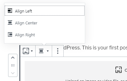
Most blocks allow you to choose block alignments. When you are working in Gutenberg in a theme not developed for Gutenberg, you get the choice between “Align Left, “Align Center” and “Align Right”.
But did you know there are actually two more? The other two, “Wide Width” and “Full Width” are perfect for making a frontpage or landing page. We’ll look closer at how to optimize your theme layout and design to fully support wide and full-width blocks later on. First you need to tell WordPress to add support for these two block alignments in your theme.
In a function hooked to after_setup_theme you simply call add_theme_support('align-wide'). You probably already have a “setup” function in your theme, or if not – add this in your theme’s functions.php:
add_action('after_setup_theme', function() {
	add_theme_support('align-wide');
});
With this code active in your theme, you should now get a total of five options for block alignments. For some blocks, for example Columns, you get only the two new ones.
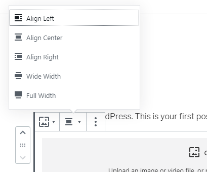
There are certain block types where you can set block alignments – mostly it’s the kind that support nested blocks, ie. a block that allows you to add blocks inside. Such popular blocks are Cover, Columns, Image, embed blocks and so on. The Cover block is a great block for building frontpages or landing pages, as we’ll see throughout this post.
Using the Cover block
The Cover block is definitely the best block when you want to build a frontpage or landing page divided in sections. You can add any kind of block and as many blocks you want to inside a Cover block. With a Cover block you can set a background color, a background image, or a background image with a color overlay.
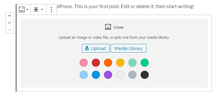
Combined with the option to set the block’s adjustment to wide or full-width (as we did above), the Cover block is a powerful tool. You can make a page where all content resides inside fullwidth Cover blocks sections with each their own background color or background image. With the correct styling and layout in your theme you have a full-blown modern frontpage builder.

In WordPress 5.3 an important improvement came for the Cover block: An inner HTML wrapper. This means the Cover block has one HTML element for the section itself – with its background color or background image, and then another HTML element where all the content resides. Combine this with a full-width block alignment: style the outer element (with the background color or image) to go completely full-width, and then style the inner HTML element with the content to fit in the container of your theme.
For example assume that your theme has a max-width container of 1200px. You probably already have a specific HTML class that is styled with max-width, ensuring that your content doesn’t simply blow full-width regardless of the screen size. Add your max-width styling to the Cover’s inner HTML; class name wp-block-cover__inner-container. As an example:
.wp-block-cover-image.alignfull .wp-block-cover__inner-container,
.wp-block-cover.alignfull .wp-block-cover__inner-container {
	position: relative;
	width: 100%;
	max-width: 1200px;
	padding: 0 20px;
}
In the CSS code above I target two Cover parent classes. The parent Cover block class changes depending on whether or not you choose a background image or not. Cover blocks with a background image gets the class “wp-block-cover-image” and Cover blocks with a background color gets the class “wp-block-cover“. In addition I also target the block alignment “Full Width” with the class “alignfull“. The “Wide Width” block alignment gets the class “alignwide“. Add CSS to target this block alignment as well – depending on what you want to do.
If you’ve started playing around with this you might have encountered problems with the general layout in theme. Your theme probably forces your full-width Cover blocks to not go full-width at all. Let’s look at this next.
Theme layout and full-width styling
So far we’ve added support for wide and full-width blocks and learned how to use and optimize the Cover block to act like frontpage or landing page sections. But in most themes your HTML and layout might prevent your post content to go full-width.
Your theme probably has a right sidebar in single post or page view. There’s probably additional HTML wrappers, including a max-width container element, which prevents your full-width blocks to actually go fullwidth. Your wrappers probably also have a fair bit of margins or padding which again prevents the full-width blocks to completely touch the edges of the screen. But you need to make single post or page look good for posts where the user don’t use Cover blocks as well. You need to consider your wrappers when developing for Gutenberg with support for wide and full-width blocks. It all depends on your theme’s design, HTML and styling – but let’s look at some ideas to solve this.
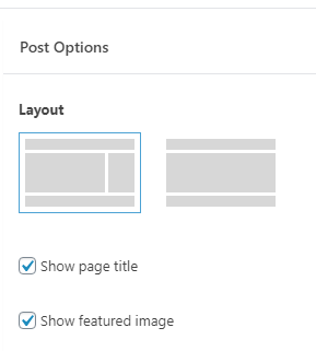
A good solution would be to add post options; custom meta settings for posts and pages that affects the layout of that page. You can make a setting to hide the sidebar or to force your post content to go completely full-width. Create post settings manually yourself by adding metaboxes, or use Advanced Custom Fields to make this process easier. And then in your theme you fetch the post settings and handle the HTML output correspondingly.
Other good post options are hiding the page title and/or hiding the featured image. This allows you to create content normally, but for specific pages you can easily set up a landing page completely with full-width Cover blocks. By hiding the standard page title you can build a better-looking header or Call to action section to act as the page title instead.
Create block styles
There’s a little-known feature in WordPress Gutenberg; blocks can have different styles. You can see block styles in action with the Quote block. Add the block in your editor and take a look at the Inspector (right sidebar). You’ll find the topic “Styles” and two options between different styles.
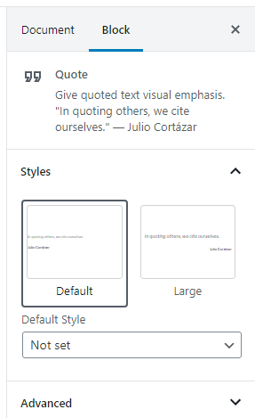
Create custom styles that makes building frontpage and landing pages easier. I suggest at least adding custom block styles to the Heading block, so that you can make custom styles without interrupting headings for normal posts. Make a block style for section titles featuring extra large font and additional padding.
As you try to create frontpages, make note of what you do have to customize repeatedly – this could be a good fit for a block style.
Adding custom block styles is actually really easy and don’t require Javascript knowledge. I have a separate tutorial on how to do this if you want to learn more about this.
PS: If you don’t see block styles, your theme might lack the support for this. The process is the same as we did for wide and full-width block alignments; in the hook after_setup_theme, you add add_theme_support('wp-block-styles'):
add_action('after_setup_theme', function() {
	add_theme_support('wp-block-styles');
});
Using theme colors as color palette
If you’ve played around with Gutenberg you’ve probably noticed that Gutenberg offers you a certain set of colors for text or background color. For instance adding a Cover block will prompt you to choose a color from a color palette.
You do have the option to use a colorpicker to pick or enter the hex color to the precise color you want. You can access this by clicking the link “Custom Color”. But if you are using the same set of colors in your theme and want to keep it consistent, it can be cumbersome to constantly remember and enter the same hex color codes every time.
Luckily WordPress Gutenberg allows you to define the color palette! This is yet another add_theme_support() where you provide an array of the colors you want in the palette. In a function hooked to after_setup_theme, do this:
add_theme_support('editor-color-palette', [
	[
		'name' => __('Main blue profile color', 'txtdomain'),
		'slug' => 'blue-profile',
		'color' => '#59BACC'
	],
	[
		'name' => __('Secondary green profile color', 'txtdomain'),
		'slug' => 'secondary-profile',
		'color' => '#58AD69'
	],
]);
In the code above we add theme support for ‘editor-color-palette‘, and as second parameter to the function we define an array of all the colors we want. Each color requires the attributes name, slug, and color. name is what appears when you hover the mouse over the color in the palette. slug is the class name that will be added onto the block element. And color defines the hex code for your color.
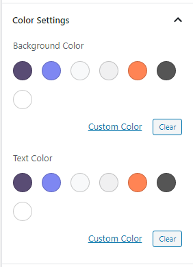
Keep in mind that you need to add styles in your CSS targeting each of these classes (defined by slug). WordPress does not automatically apply the hex color onto your blocks even though we tell WordPress what the color code is.
As an example, the image to the right is my color palette that I’ve defined for this site’s theme – for A White Pixel:
These are my theme colors and in 95% of the cases I will use one of these colors – either as background or as text color. In rare cases I can pull out the colorpicker, but having the usual suspects already defined in the color palette makes life much easier.
A tip is to always make sure to add pure black (#000000) and pure white (#FFFFFF) in your color palette. It’s probably also a good idea to have one or two light gray colors.
Using a static frontpage and optimizing the frontpage template
You probably already know about this, but I’ll mention it all the same. In WordPress you can set a static page as front page by going to Settings > Reading.
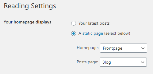
As default WordPress’ frontpage shows a list of the most recent posts. But if you select “A static page” and choose a page from the dropdown, WordPress will display this page as the frontpage to your site.
This is a no-brainer in setting up a frontpage for your WordPress site. In the selected page you can build the frontpage using all tricks mentioned above. For instance you might have unchecked post options for showing page title, sidebar and featured image. And the page is fully built with full-width Cover blocks and content. However you can choose to not go the post options (hide sidebar etc) route and simply make a frontpage template to replace or in force these.
When your WordPress is set as a static page as frontpage, WordPress will look for the template front-page.php in your theme. This will be used instead of page.php. This allows you to create and adjust a separate template that is used only for your frontpage.
In that front-page.php template you can already define HTML to ensure any blocks go completely fullwidth, has no sidebar, no page title or featured image. You might want to simply only do the_content() to output the page’s content in full.
For example, this is what I’ve got in this site theme’s front-page.php. Whereas in all the other templates, such as page.php, I have loads of outputs for sidebar, post title, and so on, this is the full extent of my loop in front-page.php:
while (have_posts()) : the_post();
	the_content('');
endwhile;
That’s it. My wrapping HTML and classes ensure that the post content is completely full-width.
Remember that this is a good solution if you as a user of the theme understands how your templates work. I know that all of my content in my frontpage must be fully wrapped inside Cover blocks. I rely on the Cover block’s inner container HTML to ensure my content look good and fall into a max-width container. If I were to add a simple Paragraph block without a wrapping Cover block, it would not look good because it would lack padding at the sides.
Making your site header transparent at first Cover block
A very common feature in modern websites is making the header transparent on the frontpage. As the user starts scrolling down the page, the header changes into a fixed styling and gets a background. But keeping a transparent header can look really nice when we can see the colors or image behind the first section.
I do this at this site’s front page. Take a look! At the very top of the page my header has no background and shows the background of the purple gradient section (a Cover block) behind. Once you start to scroll it gets a fixed solid background.
Keep in mind that you need to be aware of the colors in your header and the first cover background. If your header consists of white logo and white menu items (like mine do), you can’t use this trick with a Cover block that has a light background. That would make your header unreadable!
If you want to do this keep in mind that it requires a bit of Javascript knowledge. But it’s actually really simple. I’ll go through the very basics for you:
My whole header element is always position: fixed. Because I don’t normally want my content to disappear behind the header, I’ve added a padding-top on the body element, pushing the content down below the header. However, I’ve added a rule that if we are at the front-page template, this padding will not be added. That makes sure that only on the frontpage, the body part will appear behind the header. I then target the first Cover block at the frontpage, and adds an additional padding-top, to ensure that the content of this first block don’t butt up behind the header – giving it a nice good padding after the header.
And then I’ve added a very simple Javascript code using jQuery:
$(window).scroll(function() {
	if ($(window).scrollTop() >= 60) {
		$('#header').addClass('navbar-fixed')
	} else {
		$('#header').removeClass('navbar-fixed');
	}
});
What this code does is adding a class ‘navbar-fixed‘ when the page is scrolled further than 60px down the page. And in my CSS I simply target this class and adds a fixed background color. Without this class the header’s background is transparent on the frontpage.
That’s the basics of it. Play around with the CSS – adjust the Javascript “tip point”, and use for instance transition property to make a smoother transition when the background color gets applied.
Great blocks for frontpages and landing pages
WordPress offers a full range of blocks ready for you to use. Some of them are especially useful when building a frontpage or landing page. If you are already familiar with all the available blocks you probably already know about these.
- Columns. A block that allows nested blocks, which means you can add any blocks inside each column. You can add Columns inside a Cover block as well. Perfect for structuring content in columns. You can decide number of columns and for each column you can decide their widths. They can all be equal widths, or custom widths.
- Group. Another block that allows nested blocks. Great for setting a colored background around a bunch of other blocks (like a title and a couple of paragraphs).
- Button. There’s no frontpage without any buttons. Buttons are great as call to action and to direct your visitors to where you want them to go. You can customize the button’s look and design. Combine this with custom block styles for buttons!
- Spacer. If you feel you are lacking space in your sections, add a Spacer block – which is simply just space without any content. You can define the height of the spacer.
- Separator. Similar to the Spacer block, but adds a nice line. Another option for clearly separating content. Customize the design of the line in your theme’s CSS or add custom block styles.
- Gallery. Excellent for showcasing images. Has support for full-width block alignment, so you can create a full-width image gallery on your frontpage.
- Media & Text. A nice easy way of aligning an image or media next to text. Might be a better option than columns in some cases.
- Embeds: Youtube ++. WordPress offers a bunch of embeds for media. You can for instance have a full-width Youtube-video playing in your frontpage.
- Widgets: Search field, latest posts, calendar++. WordPress offers some nice default content elements. If you wanted to display a list of recents posts or a search bar on your landing page, go for it.
If however you feel you are lacking blocks to do what you want, the solution is to create your own custom blocks.
Creating custom blocks
A very common feature in a frontpage or landing page is a “shortcut” element; where you pick a post or page, and it outputs a block linking to the post, containing the featured image, post title, possibly the excerpt. At the time of writing this there is no such option in standard WordPress. You’d have to manually make this shortcut yourself, manually inserting the same featured image as the post, manually typing in the post title and excerpt, and wrap everything in a link.
Other examples of blocks that are very useful for frontpage and landing page building are sliders / carousels, price comparison tables, and testimonials.
To optimize for these kind of blocks you need to either find a plugin that gives you this (I have not explored this option), or make them yourself. Making your own custom blocks requires significant knowledge of Javascript and React and a good deal of coding. I recommend going this route if you are serious about being a WordPress developer though.
If you are interested in learning how to create custom blocks for Gutenberg I have a tutorial series that goes through this in detail.
You can also opt for an easier route and purchase Advanced Custom Fields Pro (ACF). With this plugin you can create custom Gutenberg blocks without any Javascript knowledge. You just control the PHP output of the blocks and let ACF handle the Javascript part. But keep in mind that this creates a dependency of your theme to a licensed plugin.
Conclusion
I hope this post has been some help to you to further develop your skills and knowledge with WordPress Gutenberg! At the time of writing this there is truly a lack of information and experience in how to optimize your theme to Gutenberg. I had especially a hard time finding something about how to nicely build a front page. So this is what I have learned by a lot of experimenting and playing around.