
So far in this tutorial series we’ve written all code inside registerBlockType()‘s edit function. It’s fully possible, and often recommended to instead assign edit to a separate component. By doing so we can utilize functionality like component state and lifecycle methods. It’s also much cleaner, readable and provides reusable code!
If you are not familiar with creating React components or what state and lifecycle methods are, I recommend reading React’s official guide on this topic first.
Defining a class component for edit
You can define a component either as a function or a class. With a class component you can use functionality like for example state and lifecycle methods. However in newer React versions (16+) you can use React hooks to simulate state and lifecycle methods inside function components. But in this tutorial we’ll focus on creating a class component. What we’ve created so far in this series, “inline” in registerBlockType() for edit and save, are function components.
For defining a class component we extend WordPress’ Component (in wp.element package), exactly like you’d extend a class component to React.Component.
Keep in mind that your class component must include the function render(). And because of how Javascript works your class must be defined before your registerBlockType() call (write your class component first in the file, and keep registerBlockType() after it. Later on in this post we’ll learn how to separate components out in separate files, export and include them).
In short, like so:
const { registerBlockType } = wp.blocks;
const { Component } = wp.element;

class FirstBlockEdit extends Component {
	render() {
		const { attributes, setAttributes } = this.props;
		return ...
	}
}

registerBlockType('awp/firstblock', {
	title: 'My first block',
	edit: FirstBlockEdit,
	save: (props) => {
		return ...
	}
});
The props from edit is automatically applied to our component. Don’t forget that a class component you need to refer to props with this.props. It’s common in WordPress Gutenberg core to use separate components for the edit functions as they most often contain a whole lot more code. The save function can often be left in registerBlockType() unless it contains a lot of code as well.
By doing this you can now write your component just like you would with React. You can add functions, contructor, state and lifecycle methods.
This is the code we ended up in the last step, converted into a class component:
const { registerBlockType } = wp.blocks;
const { Component } = wp.element;
const { RichText, InspectorControls, BlockControls, AlignmentToolbar } = wp.blockEditor;
const { ToggleControl, PanelBody, PanelRow, CheckboxControl, SelectControl, ColorPicker, Toolbar, IconButton } = wp.components;
class FirstBlockEdit extends Component {
render() {
const { attributes, setAttributes } = this.props;
const alignmentClass = (attributes.textAlignment != null) ? 'has-text-align-' + attributes.textAlignment : '';
return (
<div className={alignmentClass}>
<InspectorControls>
<PanelBody
title="Most awesome settings ever"
initialOpen={true}
>
<PanelRow>
<ToggleControl
label="Toggle me"
checked={attributes.toggle}
onChange={(newval) => setAttributes({ toggle: newval })}
/>
</PanelRow>
<PanelRow>
<SelectControl
label="What's your favorite animal?"
value={attributes.favoriteAnimal}
options={[
{label: "Dogs", value: 'dogs'},
{label: "Cats", value: 'cats'},
{label: "Something else", value: 'weird_one'},
]}
onChange={(newval) => setAttributes({ favoriteAnimal: newval })}
/>
</PanelRow>
<PanelRow>
<ColorPicker
color={attributes.favoriteColor}
onChangeComplete={(newval) => setAttributes({ favoriteColor: newval.hex })}
disableAlpha
/>
</PanelRow>
<PanelRow>
<CheckboxControl
label="Activate lasers?"
checked={attributes.activateLasers}
onChange={(newval) => setAttributes({ activateLasers: newval })}
/>
</PanelRow>
</PanelBody>
</InspectorControls>
<BlockControls>
<AlignmentToolbar
value={attributes.textAlignment}
onChange={(newalign) => setAttributes({ textAlignment: newalign })}
/>
<Toolbar>
<IconButton
label="My very own custom button"
icon="edit"
className="my-custom-button"
onClick={() => console.log('pressed button')}
/>
</Toolbar>
</BlockControls>
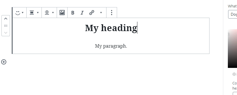
<RichText
tagName="h2"
placeholder="Write your heading here"
value={attributes.myRichHeading}
onChange={(newtext) => setAttributes({ myRichHeading: newtext })}
/>
<RichText
tagName="p"
placeholder="Write your paragraph here"
value={attributes.myRichText}
onChange={(newtext) => setAttributes({ myRichText: newtext })}
/>
</div>
);
}
}
registerBlockType('awp/firstblock', {
title: 'My first block',
category: 'common',
icon: 'smiley',
description: 'Learning in progress',
keywords: ['example', 'test'],
attributes: {
myRichHeading: {
type: 'string',
},
myRichText: {
type: 'string',
source: 'html',
selector: 'p'
},
textAlignment: {
type: 'string',
},
toggle: {
type: 'boolean',
default: true
},
favoriteAnimal: {
type: 'string',
default: 'dogs'
},
favoriteColor: {
type: 'string',
default: '#DDDDDD'
},
activateLasers: {
type: 'boolean',
default: false
},
},
supports: {
align: ['wide', 'full']
},
edit: FirstBlockEdit,
save: (props) => {
const { attributes } = props;
const alignmentClass = (attributes.textAlignment != null) ? 'has-text-align-' + attributes.textAlignment : '';
return (
<div className={alignmentClass}>
<RichText.Content
tagName="h2"
value={attributes.myRichHeading}
/>
<RichText.Content
tagName="p"
value={attributes.myRichText}
/>
{attributes.activateLasers &&
<div className="lasers">Lasers activated</div>
}
</div>
);
}
});
If you destructured attributes and setAttributes from props like we did, all you need to change when moving into a separate class component is changing one line; #9 from props to this.props. All of the code will work just like before without fixing anything else. That’s the beauty of destructuring. If you didn’t destructure it and referred to e.g. props.attributes directly, you’d need to add this. in front of all individual references to attributes and setAttributes everywhere.
Let’s start doing things we now can do with a class component!
Defining functions and this
Granted, yes, you can define functions from within edit function component, before calling return. But personally I’ve always preferred to separate functionality by logic. I find it better to separate functions for logic and other purposes outside the function that’s responsible for rendering output. Some people also prefer to call functions in events, instead of doing them inline as we’ve done so far (doing setAttributes() for onChange for example).
As of right now our code has two things that could be beneficial to move out to functions; InspectorControls and BlockControls. This will shorten our return considerably and make our code easier to read.
We define two functions that return the whole InspectorControls block and the whole BlockControls block. By using arrow functions (functionName = () => { ... }) we have full access to this for getting ahold of props. If you didn’t do the last part of step 1 – setting up Babel with the newest syntaxes, you will get compiling errors. You’d have to resort to creating a constructor and binding this for each function. You can read more about handling this in the start of React’s FAQ page.
Also remember that because we’re in a class now you need to call all its functions with this. in front.
class FirstBlockEdit extends Component {

	getInspectorControls = () => {
		const { attributes, setAttributes } = this.props;

		return (
			<InspectorControls>
				...
			</InspectorControls>
		);
	}

	getBlockControls = () => {
		const { attributes, setAttributes } = this.props;

		return (
			<BlockControls>
				...
			</BlockControls>
		);
	}

	render() {
		const { attributes, setAttributes } = this.props;

		const alignmentClass = (attributes.textAlignment != null) ? 'has-text-align-' + attributes.textAlignment : '';

		return ([
			this.getInspectorControls(),
			this.getBlockControls(),
			<div className={alignmentClass}>
				<RichText
					tagName="h2"
					placeholder="Write your heading here"
					value={attributes.myRichHeading}
					onChange={(newtext) => setAttributes({ myRichHeading: newtext })}
				/>
				<RichText
					tagName="p"
					placeholder="Write your paragraph here"
					value={attributes.myRichText}
					onChange={(newtext) => setAttributes({ myRichText: newtext })}
				/>
			</div>
		]);
	}
}
Note that I’ve excluded the actual contents of InspectorControls and BlockControls to keep the code shorter. Nothing in their code needs to change.
We are also utilizing the fact that the return statement can also return an array. Everything in the array will be rendered as usual in the order they are in. This makes it easy for us to call functions directly inside the return statement.
You can obviously also define lifecycle methods, such as componentDidMount(). There’s no difference in doing these in Gutenberg components than in React.
Constructor and using state
Let’s try to implement state in our component. Keep in mind that state is only something stored temporarily within our class component and isn’t saved anywhere – such as in attributes. It’s just to keep control of – well – the state of your component. Common uses of state are using state as a status flag while waiting for an async call to return, keeping score of something temporary before saving it in an attribute, or implementing block “preview/edit modes”.
You refer to state and updating state just like in React; with this.state and setState(). Normally you’d initialize the state in constructor. And as for defining a constructor – it’s exactly like in React – don’t forget to pass props and do super(props) as well. In short:
class FirstBlockEdit extends Component {
	constructor(props) {
		super(props);

		this.state = {
			example: 1
		}
	}

	render() {
		this.setState({ example: 2 });
		console.log(this.state.example);
		...
Block mode edit/preview toggler
Let’s use what we learned in the previous step in Toolbars to create a “mode switcher” for our block. We implement a toolbar with a button that toggles state between preview and edit mode. In edit mode the block gets the two RichText components as usual. But when switching to preview mode, we disabled editing and render the block output.
First we create a constructor and sets up state with one boolean property; editMode which starts as true. The super(props) is necessary when defining a constructor in a class-based React component.
class FirstBlockEdit extends Component {
	constructor(props) {
		super(props);
		this.state = {
			editMode: true
		}
	}
	...
In our function for outputting the toolbars we change the custom button we created earlier (which only console.log something when clicking on it). On its onClick prop we call setState() and negates the current editMode boolean value. To make it easier for the user to understand we toggle between the button’s icon and label as well. E.g. when preview mode is active, the button shows the label “Edit” and an pencil icon that is commonly acceptable as edit.
getBlockControls = () => {
	const { attributes, setAttributes } = this.props;
	return (
		<BlockControls>
			<AlignmentToolbar
				value={attributes.textAlignment}
				onChange={(newalign) => setAttributes({ textAlignment: newalign })}
			/>
			<Toolbar>
				<IconButton
					label={ this.state.editMode ? "Preview" : "Edit" }
					icon={ this.state.editMode ? "format-image" : "edit" }
					onClick={() => this.setState({ editMode: !this.state.editMode })}
				/>
			</Toolbar>
		</BlockControls>
	);
}
And finally inside the main render method for our block, we can do what we will. This part is really up to you – you do the same as we did with the label and icon on the button above. We add two blocks of output, one if this.state.editMode is true (which should be the usual editable RichText components), and another if it’s false.
As an example I’m using two WordPress component from wp.components; Placeholder and Disabled for the preview mode. The Placeholder component puts your block in a nice grey box which makes it really clear that it’s non-editable. Keep in mind that it comes attached with styling so if you wanted a perfect preview this might not be for you. And I also wrap everything inside a Disabled component which makes everything inside uneditable, unclickable and undraggable. This is our new render() function in our component:
const { ..., Fragment } = wp.element;
const {... Placeholder, Disabled } = wp.components;  // Don't forget to add these at the top

...
render() {
	const { attributes, setAttributes } = this.props;
	const alignmentClass = (attributes.textAlignment != null) ? 'has-text-align-' + attributes.textAlignment : '';

	return ([
		this.getInspectorControls(),
		this.getBlockControls(),
		<div className={alignmentClass}>
			{this.state.editMode &&
				<Fragment>
					<RichText
						tagName="h2"
						placeholder="Write your heading here"
						value={attributes.myRichHeading}
						onChange={(newtext) => setAttributes({ myRichHeading: newtext })}
					/>
					<RichText
						tagName="p"
						placeholder="Write your paragraph here"
						value={attributes.myRichText}
						onChange={(newtext) => setAttributes({ myRichText: newtext })}
					/>
				</Fragment>
			}
			{!this.state.editMode &&
				<Placeholder isColumnLayout={true}>
					<Disabled>
						<RichText.Content
							tagName="h2"
							value={attributes.myRichHeading}
						/>
						<RichText.Content
							tagName="p"
							value={attributes.myRichText}
						/>
					</Disabled>
				</Placeholder>
			}
		</div>
	]);
}
...
I am also using a component Fragment (wp.element package) which is the same as React.Fragment. If you are not familiar with it, we wrap output inside it when we don’t want to add extra unecessary HTML wrappers. In React everything must have a root node. When edit mode is active (line #13) we output two RichText components right after each other, so we need a rootnode around them.
When preview mode is active (line #29) we output the two RichText components’s values. Like we do in save, we use RichText.Content to return their values instead of the little editor.
The component Placeholder comes in flex styling and as default with flex-direction row. Providing true in the prop isColumnLayout changes it to flex-direction column (so everything stacks). But as mentioned before – you might want to skip this component and rather generate your preview exactly like it would be in frontend.
And with that we have a block mode preview/edit toggler. Obviously you can adjust the content of the “edit mode” to show e.g. control inputs or whatnot.
You can create as many components as you’d like, you’re not limited to just having one for the edit function! Simply create more components and include them within a return statement. That’s the idea of React, actually – building encapsulated pieces of code, possibly each handling their own state and combine them to make complex UIs.