
In this post we’ll learn how to add WordPress’ toolbars to our block, i.e. for alignment and block alignment. We will also learn to add our own toolbars with our own buttons for doing custom actions.
Adding toolbars
In order to add something to the toolbar for our block we’ll need to wrap what we want in it inside a component called BlockControls (from wp.blockEditor). Inside this component we can add either one of WordPress components for the standard toolbars we know from other blocks (for example alignment) or we can add our own toolbar.
As default a block will have a toolbar containing only the block’s icon (for the Transform to functionality) and the block menu for e.g. removing the block. We can’t remove those, but we can add our own buttons and toolbars inbetween.
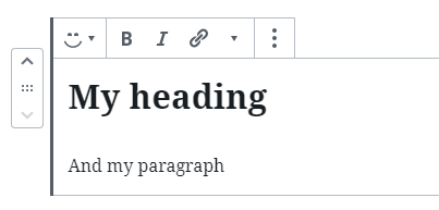
However some certain WordPress components will by themselves add their own toolbars. As of right now our block shows a toolbar for text formatting that comes from the RichText component we added in.
Adding a block alignment toolbar
The block alignment toolbar exists on practically all WordPress block types, so let’s add that to our block as well. Behind the scenes it exists a component BlockAlignmentToolbar which we could add, however I recommend not to. Using it requires you to manually handle the classes for block alignment and making sure the block extends its width in the editor when choosing “Wide Width” or “Full Width”. Luckily WordPress has made it really easy to implement it, fully automatic.
We can add a new property to our object configuration in registerBlockType(), called supports. There are a few other features but what we are interested in here is align. We can either set align to true to add all possible alignments, or we can provide an array of precisely which alignments we allow for our block.
...
registerBlockType('awp/firstblock', {
	...
	supports: {
		align: true
	},
	edit: (props) => {
		...
});
Which gives us this in the editor:
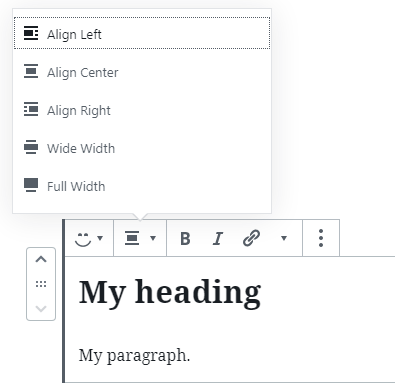
If you wanted to for example prevent anyone ever using Wide Width or Full Width, you can provide an array and exclude those two. The names of the block alignments are as follows: left, right, center, wide, and full.
supports: {
	align: ['left', 'right', 'center']
},
Need default alignment?
By default the block gets no block alignment. If you wanted to you can set a default by making an attribute with the key align, set the type to string and set the default there. WordPress will automatically connect this attribute to the block alignment.
attributes: {
	align: {
		type: 'string',
		default: 'center'
	}
},
supports: {
	align: true
},
With this whenever a new block of our type is created, the default block alignment is centered.
Block alignment styling mess? Not our fault
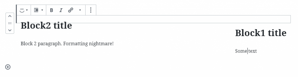
Note: The default block styling from WordPress will mess up the flow of your post content when using left and right block alignment. The same thing happens with other block types from WordPress as well and is not exclusively our block’s problem. This is caused by adding float to the element, which collapses the parent element. Believe me, I have tried constructing the block to avoid this issue. The only thing I’ve found to be working properly without messing with the other block alignments are by adding styling to the editor and adjust the float styling.
Regardless, WordPress has made it pretty easy to implement block alignment. Now let’s look at other toolbars we can use.
Adding a text alignment toolbar
If you rather want the toolbar for text alignment you can do this instead of block alignment – in this toolbar we have only left, center and right-align. As a matter of fact you can use both text alignment and block alignment together – they work separately. In order to not confuse users, you could for example only add support for wide and fullwidth block alignment, and use text alignment toolbar for controlling the left, center or right-align. By doing this you avoid the above mentioned issue with the flow of blocks in the editor. It’s up to you how you want your block to function.
WordPress has a component to output the text alignment toolbar however no automatic handling of adding the correct classes for actually making the content aligned – both inside the editor and the frontend (as far as I’ve found at least!). We need to manually add and update an attribute for the text alignment.
Adding BlockControls and AlignmentToolbar
Let’s finally add BlockControls to our edit function for our output in the toolbar. The component for text alignment is AlignmentToolbar from wp.blockEditor package.
const { registerBlockType } = wp.blocks;
const { RichText, InspectorControls, BlockControls, AlignmentToolbar } = wp.blockEditor;
const { ToggleControl, PanelBody, PanelRow, CheckboxControl, SelectControl, ColorPicker } = wp.components;

registerBlockType('awp/firstblock', {
	title: 'My first block',
	category: 'common',
	icon: 'smiley',
	description: 'Learning in progress',
	keywords: ['example', 'test'],
	attributes: {
		myRichHeading: {
			type: 'string',
		},
		myRichText: {
			type: 'string',
			source: 'html',
			selector: 'p'
		},
		textAlignment: {
			type: 'string',
		}
	},
	supports: {
		align: ['wide', 'full']
	},
	edit: (props) => {
		const { attributes, setAttributes } = props;

		const alignmentClass = (attributes.textAlignment != null) ? 'has-text-align-' + attributes.textAlignment : '';

		return (
			<div className={alignmentClass}>
				<InspectorControls>
					...
				</InspectorControls>
				<BlockControls>
					<AlignmentToolbar
						value={attributes.textAlignment}
						onChange={(newalign) => setAttributes({ textAlignment: newalign })}
					/>
				</BlockControls>
				<RichText
					tagName="h2"
					placeholder="Write your heading here"
					value={attributes.myRichHeading}
					onChange={(newtext) => setAttributes({ myRichHeading: newtext })}
				/>
				<RichText
					tagName="p"
					placeholder="Write your paragraph here"
					value={attributes.myRichText}
					onChange={(newtext) => setAttributes({ myRichText: newtext })}
				/>
			</div>
		);

	},
	save: (props) => {
		const { attributes } = props;

		const alignmentClass = (attributes.textAlignment != null) ? 'has-text-align-' + attributes.textAlignment : '';

		return (
			<div className={alignmentClass}>
				<RichText.Content
					tagName="h2"
					value={attributes.myRichHeading}
				/>
				<RichText.Content
					tagName="p"
					value={attributes.myRichText}
				/>
				{attributes.activateLasers &&
					<div className="lasers">Lasers activated</div>
				}
			</div>
		);
	}
});
Note that I’ve excluded the content of everything we created in InspectorControls in the previous step to shorten the code.
In between line #37 to #42 is the entire content of our toolbar (apart from the block alignment automatically added by the supports property and the text formatting added by our RichText components). We use BlockControls to access the toolbar, and inside we add the AlignmentToolbar component.
As we’ve done several times with inputs we provide a value prop for showing the saved value and an onChange prop for updating our attribute to the AlignmentToolbar component. The attribute we’ll use for storing the chosen text alignment is defined as textAlignment and must be type string. As usual you can provide a default to ensure that newly created blocks get a default alignment.
In order to ensure that the block both outputs the alignment information and also gets styled correctly (so we actually see the text change alignment) both in the editor and in frontend, we need to manually set up the right class on the wrapping div. In both edit and save I define a variable that checks if attributes.textAlignment is set. If it is I build the class name following WordPress’ standards for text alignments, which is “has-text-align-(left|center|right)”. With this class WordPress will apply its styling onto our block and make sure our block visually gets aligned correctly, both in the editor and frontend.
Adding custom toolbars with our own buttons
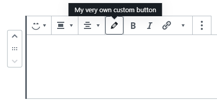
You can also add your own buttons in the toolbar to do whatever you wish when clicking on them. To do this you’ll want to add the component Toolbar and inside this element add an IconButton (both in the wp.components package). All within BlockControls of course.
You can obviously combine multiple toolbar components within BlockControls. With the code below we add the text alignment toolbar, and our custom toolbar with one button after it.
<BlockControls>
	<AlignmentToolbar
		value={attributes.textAlignment}
		onChange={(newalign) => setAttributes({ textAlignment: newalign })}
	/>
	<Toolbar>
		<IconButton
			label="My very own custom button"
			icon="edit"
			className="my-custom-button"
			onClick={() => console.log('pressed button')}
		/>
	</Toolbar>
</BlockControls>
The IconButton component accepts a WordPress dashicon icon or a SVG to the prop icon. We can provide some other props such as className and label (will appear in the tooltip when hovering over the button). The prop we are most interested in is obviously the onClick prop which fires when the button is clicked. Here we can provide a function and basically do whatever we want. The possibilities are endless and depends on what you want to do. In the code above I simply console log something when the button is clicked. As we progress in this tutorial series you’ll probably get some ideas how to make your custom button do what you want it to do.
This is what we’ve made so far. In the next step of the series we’ll start looking at more advanced stuff and we’ll learn how to create our own components to utilize state and other benefits.