
The previous step in this tutorial series went through how to register a custom block, both in Javascript and in PHP. In this step we’ll learn how to use WordPress’ components for adding different kind of fields and settings.
In order to utilize WordPress’ components in our block we need to first know about props.
Props
Props is a major feature in React and is basically a way of passing variables or functions down to other components. If you are unfamiliar with React props, you can read React’s official tutorial about this.
WordPress provides some props for the edit and save functions in registerBlockType(). Inside these props we get access to critical things, such as attributes and a method to update our attributes. We’ll go through attributes in detail in the next step!
So far in our block we wrote the function for edit and save like so:
edit: () => {
	return <div>:)</div>
},
You should get used to adding the parameter props to both edit and save, like so:
edit: (props) => {
	return <div>:)</div>
},
Now you have full access to the variable props and everything it contains from within edit and save. If you are curious, you can add a console.log(props); in the edit function before the return statement. You should see what props are available in console debugger.
Using WordPress’ components
As mentioned before we have access to a huge library of components and useful functions inside the global package wp. You’ll find ready-to-use components for any type of input-related components you can think of. Examples include text inputs, rich text inputs, dropdowns, toggle, checkboxes, buttons in different styles, media uploader, and color pickers. There are also functions and components for more advanced functionality. Such as querying WordPress for content (posts, categories, etc) with either built-in functions or fetching with REST API.
It’s both easier and recommended to use WordPress’ UI components. This is to make sure the design and functionality are as streamlined as possible to not confuse or annoy the users.
But unfortunately at the time of writing this the documentation for Gutenberg is very scarce. I’ve found the best way to learn about what exists within the wp package and how the components work is actually by looking in their official Gutenberg Github repo. Some of the packages (folders) have a readme text that offers a bit of documentation. Take a look at the readme for a button or the toggle for example.
The Github repo should correspond to what’s inside the wp package (depending on which version you have and which branch you’re looking at in Github). This means each folder you see in the root packages directory in Github resides in the global wp package. As an example remember that the function we used in previous step, registerBlockType(), was inside wp.blocks, which means you’ll find the source code for this function exported within packages/blocks/.
As I’ve developed a number of custom Gutenberg blocks and digged quite a bit in the Github repo, I’ve found that there are a few packages that contain the most common functionality used for creating custom blocks. I’ll include them below.
For a more complete overview of available components, I recommend downloading my free eBook covering available components in Gutenberg! It contains the most common and useful components with documentation on props and code examples:
A quick overview of most common packages you’ll use for blocks
Obviously there are much more available, but the below is what is most common for blocks development. We’ll use most if not all of these in this tutorial series. Whenever you want to use a component, you need to know in which package it is in.
wp.components
You’ll find most UI input components inside wp.components. Examples are different text inputs, select, checkboxes, radio buttons, draggable components, buttons, colorpicker, datepicker, and so on. You’ll also find UI components that you can use for the block toolbar and content of the settings sidebar (called InspectorControls) in editor.
Check out the folders in the Github repo.
wp.blockEditor and wp.editor
In these two packages you will find useful components for rich text, handling images / media uploader, and components for actually adding toolbars or custom Inspector (sidebar) panels.
At the end of this series we’ll look at building dynamic blocks in which we’ll use PHP for rendering the block output, and for that we’ll use a component from wp.editor.
As I understand it, most components started in wp.editor in early Gutenberg days, but especially after WordPress 5.3, a lot of them were moved into wp.blockEditor. If you use a component in wp.editor that WordPress plans to move into wp.blockEditor it won’t fail as of now, but in console debugger you will get warnings that it has been deprecated and that you should switch to wp.blockEditor when you can. And reversibly if you are following this series with an older WordPress version of some reason you might encounter errors when calling components that’s not moved into wp.blockEditor yet.

wp.element
Inside wp.element you’ll find components that correspond to React components. For example Component (which corresponds to React.Component) and Fragment (React.Fragment). We will use these when we start splitting up our code into separate components.
wp.i18n
As the name states the wp.i18n package contains functions for handling translation. It contains the same translation functions as we know them in PHP; for example __() and _e(). We’ll look at this in detail in <<<<step XX>>>>> when we learn about how to translate our block.
wp.data
The wp.data package is for querying WordPress for data outside the editor. There are components for dispatching messages, withSelect and select which we’ll use later in this series for querying posts inside our block.
wp.compose
The previous package and wp.compose are for more advanced block building. Inside this package we’ll find components and functions to create so called higher-order components. Higher-order components is a pattern technique in React for reusing components and logic, and we’ll use this in combination with wp.data in order to query posts.
Enough talk – how do you use some of these components in practice?
As mentioned earlier; in order to use WordPress’ components you need to know where they are. Hopefully my overview above combined with the Github repo will give you some idea where to get them.
Don’t forget that you can always add any normal HTML tags, such as div, span, headings, and so on. Just remember to follow React’s guidelines in attributes. For example class is a reserved keyword in React (for creating class-based components), so if you want to add a class to a HTML element you need to use className.
Note: While developing, don’t forget to initiate npm run start to compile your code.
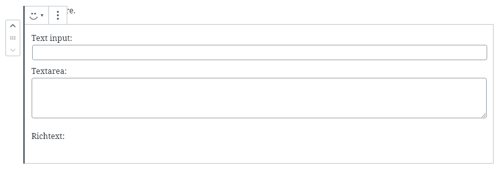
As a simple example let’s try out a few components to see how they look like. We destructure them from their corresponding packages and use them in our edit function.
const { registerBlockType } = wp.blocks;
const { RichText } = wp.blockEditor;
const { TextControl, TextareaControl } = wp.components;

registerBlockType('awp/firstblock', {
	...
	edit: (props) => {
		return (
			<div>
				Text input:
				<TextControl />
				Textarea:
				<TextareaControl />
				Richtext:
				<RichText />
			</div>
		);
	},
	...
});
This for example will result in our block looking like this in editor.
You’ll notice that you’ll get error messages in Console when you type in them, and that it won’t save what you type in upon updating the post (and refreshing). This is because we’re missing props on the components which is the connection to attributes, where all our block data is stored. The props are responsible for passing the saved values and functions responsible for updating our attributes when something is changed in our inputs. This is what we will do in next step, where we’ll finally start writing some code for real.