
This tutorial will go through how to create a dynamic WordPress Gutenberg block. The end result is a slider showing featured image from selected category posts. The code includes using a higher-order-component (withSelect) to fetch all categories within the block editor.
What we will make
The block will render a simple slider using the jQuery Cycle2 script. But you can use any other slider script. The block will inside editor render a list of all categories allowing the user to select one category. When displaying the block in frontend it will dynamically fetch posts from the chosen category and show their featured images as slides. This tutorial will keep it pretty simple allowing you to expand and adjust on your slider however you like.
I have opted to not render the slideshow inside the editor. Usually you’d make sure the render in editor and frontend are the same. But in the case of a slider I like to keep it simple as not to blast the user with constant animations within the editor.
The block will have only two settings; the choice of category and the number of slides (posts). I recommend adding more settings such as slide speed, settings for displaying pills, arrows, text, and other typical slider settings. It should be pretty simple to add these settings yourself.
All code is written in Javascript ES6 / ES2015+. Keep in mind that this code needs Babel to transform and build the final Javascript files. Check out the guide below if you don’t know how.
Set up the files
In this example we are creating the block inside a theme. In the theme folder I have a subfolder ‘gutenberg/‘ where I’ve placed my package.json and webpack-config.js. Inside the subfolder ‘src/‘ in this folder is where I place all my build files. My webpack config is set up to place the build files in my theme subfolder ‘assets/js/‘.
Create a new empty source file in theme-folder/gutenberg/src/block-slider.js and set up Webpack to create the build file into theme-folder/assets/js/block-slider.js. You can change the locations and/or filenames however you’d like, just remember to adjust the code below.
We also need to download the necessary slider script. You can download Cycle2 at this link, or you can use any other slide script and adjust the code below. I’m placing the jquery.cycle2.min.js file into my theme folder /assets/js/ folder.
I will also prepare a small CSS file that will be loaded in editor only. We just a small piece of styling to make the category select optimal. I create an empty file editor-block-slider.css and place it in theme-folder/assets/css/.
Finally we go to a PHP file that is loaded in the theme. For simplicity’s sake I’m doing the PHP part in the theme’s functions.php.
Register the Gutenberg block in PHP
All Gutenberg blocks must be registered with register_block_type(). I prefer to call it inside a function hooked to init. The first parameter is your block name including namespace. I’ve decided to call my slider script awp/slider (adjust as you like). The second argument is an array of arguments.
Within the same function I will register the build script with wp_register_script() and register my editor CSS file with wp_register_style(). Both of these handles will be added as arguments to ‘editor_script‘ and ‘editor_style‘, respectively. As for dependencies I’ve added some of the most basic packages for the script to ensure our block script is loaded in the right order. As for the editor style using ‘wp-edit-blocks‘ is a good dependency to avoid your styles being overridden.
And finally because this is a dynamic block, we need to also add the ‘render_callback‘ argument, pointing to a function that is responsible for rendering the block in frontend.
functions.php
add_action('init', function() {
	wp_register_script(
		'awp-block-slider-js',
		get_template_directory_uri() . '/assets/js/block-slider.js',
		['wp-blocks', 'wp-element', 'wp-editor', 'wp-components', 'wp-data']
	);
	wp_register_style(
		'awp-block-slider-style',
		get_template_directory_uri() . '/assets/css/editor-block-slider.css',
		['wp-edit-blocks']
	);

	register_block_type('awp/slider', [
		'editor_script' => 'awp-block-slider-js',
		'editor_style' => 'awp-block-slider-style',
		'render_callback' => 'awp_gutenberg_slider_render',
	]);
});
Finally we define the render function. We get two parameters to the function callback; an array of attributes from the block, and the inner content (not used in this block). I will simply return some dummy string. We will come back and flesh out the render function later. Remember to return a string, not echo.
functions.php
function awp_gutenberg_slider_render($attributes, $content) {
	return 'Slider render comes here.';
}
We will come back to the PHP render function at the very end of this tutorial. Now it’s time to move on to Javascript!
Register a custom Gutenberg block in Javascript
Let’s open up our block-slider.js source file. At this point I’ll start the script (npm run start) to transform everything we do in this file into the build file as we go. We need to register the block using registerBlockType(). Check out the link to see all possible arguments.
As we decided in register_block_type() in PHP, our block is named awp/slider. We also want to add two attributes to the block, as previously mentioned: one for the selected term ID and one for the number of slides.
I like to add the block alignment functionality as well. It will be added automatically by adding ‘align‘ to the supports object. If you want all block alignments you could simply set align to true. However a left- or right-aligned slider doesn’t make much sense so I’ll define the specific types of block aligns this block supports: “Align center” (‘center‘), “Wide width” (‘wide‘), and “Full width” (‘full‘). Also, in order to define a default align and make it accessible from PHP, I add ‘align‘ as attribute to our block.
I set the block’s edit argument to a separate component that we’ll create next. And finally the save function simply returns null, because this is a dynamic block.
block-slider.js
const { __ } = wp.i18n;
const { registerBlockType } = wp.blocks;

registerBlockType('awp/slider', {
	title: __('AWP Slider', 'awp'),
	icon: 'slides',
	category: 'common',
	supports: {
		align: ['center', 'wide', 'full']
	},
	attributes: {
		align: {
			type: 'string',
			default: 'center'
		},
		termId: {
			type: 'number',
			default: 0
		},
		numSlides: {
			type: 'number',
			default: 3
		},
	},
	edit: BlockEdit,
	save: () => { return null; }
});
We need to define the component for the edit property. Before the registration code I define a function component BlockEdit that simply renders a div and a Placeholder with some dummy text.
block-slider.js
const { __ } = wp.i18n;
const { registerBlockType } = wp.blocks;
const { Placeholder } = wp.components;
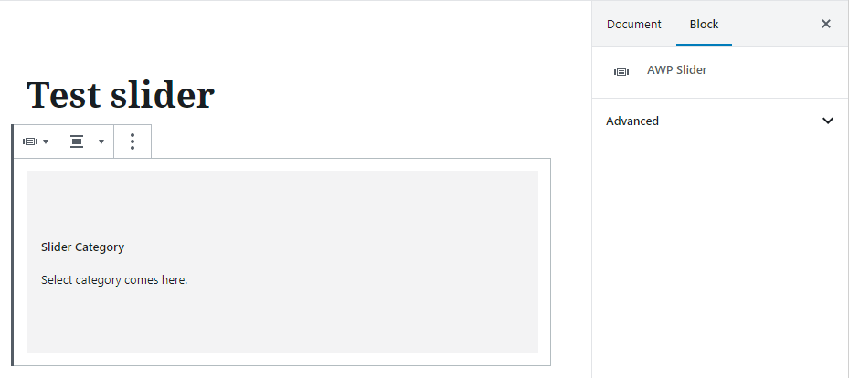
const BlockEdit = (props) => {
return(
<div className={props.className}>
<Placeholder
label={__('Slider Category', 'awp')}
>
Select category comes here.
</Placeholder>
</div>
);
}
registerBlockType('awp/slider', {
...
Placeholder is a nice component for rendering an area for settings – and not necessarily for a block’s actual render. Inside the Placeholder component is where we render a list of terms to choose from.
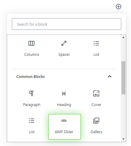
At this point our block should be available in WordPress Gutenberg! Let’s create a new post, add a new block and find our block inside the Common category. This is what our block currently looks like:
Adding Inspector settings
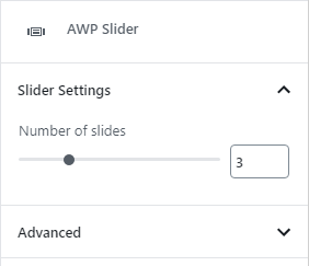
Let’s add some settings to the Inspector (editor right sidebar). As mentioned our block only has one setting; number of slides. This is where I recommend you adding more settings for your slider block. Remember to register attributes for each setting you add.
In order to add something to the Inspector we use the InspectorControls (wp.blockEditor) component. Inside we render a PanelBody (wp.components) in order to add a new collapsible section. Then we simply render a RangeControl (wp.components) to create an input setting to choose the number of slides. We set the minimum to 1 and maximum to 10. We connect the value and onChange event to the attribute numSlides.
block-slider.js
const { __ } = wp.i18n;
const { registerBlockType } = wp.blocks;
const { InspectorControls } = wp.blockEditor;
const { Placeholder, PanelBody, RangeControl } = wp.components;

const BlockEdit = (props) => {
	const { attributes, setAttributes } = props;

	return(
		<div className={props.className}>
			<InspectorControls>
				<PanelBody
					title={__('Slider Settings', 'awp')}
					initialOpen={true}
				>
					<RangeControl
						label={__('Number of slides', 'awp')}
						value={attributes.numSlides}
						onChange={(val) => setAttributes({ numSlides: val })}
						min={1}
						max={10}
					/>
				</PanelBody>
			</InspectorControls>
			<Placeholder
				...
With the above code we should now get a nice section with a range slider for setting the number of slides.
Again, I recommend you playing around adding more settings to your slider. The next step is creating the element to render a list of categories to choose from.
Creating a category select component
To keep our code tidy and reusable, let’s create the category selector component in a separate file. Inside the build folder I create a new file awp-category-picker.js.
Inside this file we define a component that will loop through all categories currently in WordPress, and render them in some way. In order to get categories we need to wrap it inside a so-called higher-order-component, which will provide our component with what we need via props. To do this we will use withSelect. Inside withSelect we can make a request to fetch all categories in WordPress by using the store selector select(). We can use:
select('core').getEntityRecords('taxonomy', '<category_slug>', <args>)
to fetch all terms within provided taxonomy slug. If you are unfamiliar with higher-order-components and selectors in WordPress Gutenberg, I have a post that explains this concept in more detail: Create a Custom Gutenberg Block – Part 10: Fetching Posts and Higher-Order Components.
Because we need to export a component from this file, we place the combination of withSelect and our defined component at the export default statement. Our CategorySelect component simply returns a div with some dummy text so we can see that it works. The withSelect should provide the prop ‘terms‘ to CategorySelect. I’ve added a console.log() on this prop so we can see that it works.
awp-category-picker.js
const { withSelect } = wp.data;

const CategorySelect = (props) => {
	console.log(props.terms);

	return(
		<div>This is category select</div>
	);
}

export default withSelect((select, props) => {
	return {
		terms: select('core').getEntityRecords('taxonomy', 'category', {per_page: -1})
	}
})(CategorySelect);
The last thing we need to do is actually import and use this category selector component in our custom block.
Back in block-slider.js we first need to import the component at the top of the file. And inside our Placeholder component we simply render out the component.
block-slider.js
const { Placeholder, PanelBody, RangeControl } = wp.components;

import CategorySelect from './awp-category-picker';

const BlockEdit = (props) => {
		...
			<Placeholder
				label={__('Slider Category', 'awp')}
			>
				<CategorySelect
				/>
			</Placeholder>
		...
With the above code your block should now render the div from the CategorySelect component. If you open up the Console in your browser you should also see some logs. Remember that withSelect is a async query which means it might render multiple times. The first time(s) the prop terms is null. But the last log(s) should end up with an array of category terms.
Great! Let’s continue working with our CategorySelect component and make it actually render the list of terms allowing the user to select one!
Rendering a list of terms to choose from
There are many ways to render a list of choices where the user can select one item. If you want something really simple you could render a standard select dropdown (SelectControl). It’s entirely up to you. I’ve opted for a cleaner and nicer approach by using MenuGroup (wp.components) and MenuItem (wp.components).
Inside a MenuGroup component we need to loop through the props.terms array, and for each item we want to display a MenuItem component rendering out the term name. And of course we only want to render this if props.terms actually contains something (async request, remember?).
awp-category-picker.js
const { withSelect } = wp.data;
const { MenuGroup, MenuItem } = wp.components;

const CategorySelect = (props) => {
	const { terms } = props;
	return(
		<MenuGroup
			className="awp-categoryselect"
		>
			{terms && (
				terms.map((item) => (
					<MenuItem
						role="menuitemradio"
					>
						{item.name}
					</MenuItem>
				))
			)}
		</MenuGroup>
	);
}

export default withSelect((select, props) => {
	...
I’ve given the MenuGroup component a custom class, since we will need to target this with CSS. And I’ve set the prop role on MenuItem to ‘menuitemradio‘ to make sure only one can be chosen at a time. As default they work as checkboxes, thus allowing multiple items to be chosen.
With the above code our block should now (after a small second) render a nice list of all categories in your WordPress instance.
You might notice that our block will expand to contain all categories. If we are in a WordPress instance with a lot of categories, this quickly becomes a problem. We want to make sure the selector is a max-height container that gets a vertical scrollbar if there are many categories. This is where our CSS file comes in.
In our editor-block-slider.css file add:
editor-block-slider.css
.awp-categoryselect div {
	max-height: 200px;
	overflow: hidden scroll;
	border: 1px solid #b3bcc0;
}
This CSS targets the inner div inside our MenuGroup and makes sure it never get higher than 200px. If the content of the MenuGroup gets larger (more categories) it will show a vertical scrollbar. This is the bare minimum of CSS for our block, but you can of course add more CSS if you’d like.
The last thing we need to fix in our category selector is the functionality to show the current selected item, and allowing the user to select a term from the list. For this we need to pass some props to this component from our block.
In block-slider.js we need to pass the current selected term (value of attribute termId) and a function to update the selected term (setAttributes) as props to our category selector component.
block-slider.js
...

const BlockEdit = (props) => {
	const { attributes, setAttributes } = props;

	const selectTerm = (termId) => {
		setAttributes({ termId: termId });
	}

	return(
		...
			<Placeholder
				label={__('Slider Category', 'awp')}
			>
				<CategorySelect
					selectedTermId={attributes.termId}
					selectTerm={selectTerm}
				/>
			</Placeholder>
		...
In the above code at line #6 we define a function that simply updates the attribute termId. We pass this function name as prop to CategorySelect at line #17. And at line #16 we pass the current value of termId. With we can update our CategorySelect component to reflect the chosen item, and allow the user to actually choose a term.
Back in awp-category-picker.js we add some new props onto MenuItem. We return true or false for the prop isSelected whether or not the current term ID is the same as the current selected one. We initiate the selectTerm function in the onClick event, passing the term ID. And to make the selected item visual we conditionally add an icon before each item.
awp-category-picker.js
...
const CategorySelect = (props) => {
	const { terms, selectedTermId, selectTerm } = props;

	return(
		<MenuGroup
			className="awp-categoryselect"
		>
			{terms && (
				terms.map((item) => (
					<MenuItem
						role="menuitemradio"
						isSelected={item.id == selectedTermId}
						icon={item.id == selectedTermId ? 'yes' : 'no-alt'}
						onClick={() => selectTerm(item.id)}
					>
						{item.name}
					</MenuItem>
				))
			)}
		...
With this our category selector should look like this:
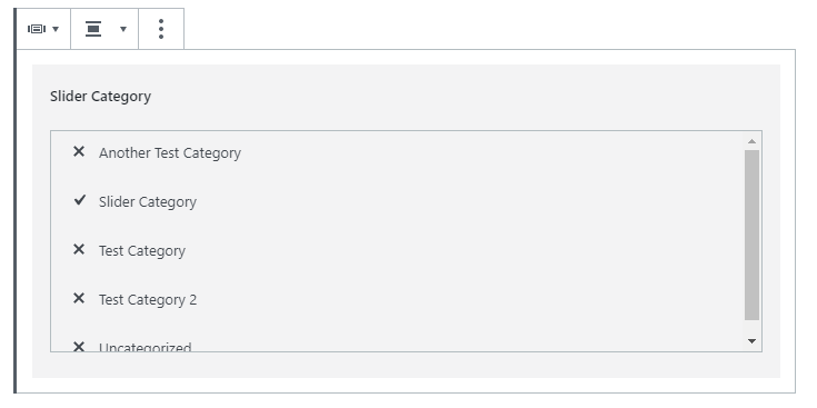
The list should clearly mark the selected term with a check icon, and you can click on any term to select that term instead.
That was everything for the editor and Javascript part! What remains now is the frontend render, which we will do in PHP.
Render the dynamic block in PHP
Before we dive into the render function let’s take care of some things first.
First we need to enqueue the cycle2 script in frontend so that our slider code actually turns into a slider. We do this with a simple function hooked to wp_enqueue_scripts. Adjust the below if you opted for another slider script.
functions.php
add_action('wp_enqueue_scripts', function() {
	wp_enqueue_script(
		'cycle2-slider-js',
		get_template_directory_uri() . '/assets/js/jquery.cycle2.min.js',
		['jquery'],
		'',
		true
	);
});
Secondly we want to return to the register_block_type() function call. When we handle dynamic blocks we should definitely add a new argument; attributes. In this argument we define all attributes that we’ve defined in registerBlockType in Javascript, including their defaults. If we don’t, not all the attributes will be available in our render callback. If an attribute was left unchanged in the block editor, the attribute and its value will not be available in the attributes array in PHP. So I recommend that you always take care to add the attributes array to the PHP register_block_type() function when you work with dynamic blocks. For our block it would look like this:
functions.php
register_block_type('awp/slider', [
	'editor_script' => 'awp-block-slider-js',
	'editor_style' => 'awp-block-slider-style',
	'render_callback' => 'awp_gutenberg_slider_render',
	'attributes' => [
		'align' => ['type' => 'string', 'default' => 'center'],
		'termId' => ['type' => 'number', 'default' => 0],
		'numSlides' => ['type' => 'number', 'default' => 3]
	]
]);
Now we return to our callback render function awp_gutenberg_slider_render(). The output is completely up to you, especially if you’ve chosen to use another slider script. The below is a simple example.
The main idea is that we check whether or not a term was chosen ($attributes['termId']). If it is populated we create a WP_Query() with arguments for the number of posts ($attributes['numSlides']) and the selected category ID. Then it’s a matter of generating the proper HTML for cycle2 to work, loop over the posts, and display their featured images as slides.
functions.php
function awp_gutenberg_slider_render($attributes, $content) {
	if (empty($attributes['termId'])) {
		return '';
	}

	$postQuery = new WP_Query([
		'posts_per_page' => $attributes['numSlides'],
		'cat' => $attributes['termId']
	]);

	if ($postQuery->have_posts()) {
		$output = '<div class="wp-block-awp-slider align' . $attributes['align'] . '">';
		$output .= '<div class="cycle-slideshow" data-cycle-timeout=4000>';
		while ($postQuery->have_posts()) {
			$postQuery->the_post();

			if (has_post_thumbnail()) {
				$img_url = get_the_post_thumbnail_url(get_the_ID(), 'loop-thumbnail');
				$output .= '<img src="' . $img_url . '" />';
			}
		}
		wp_reset_postdata();
		$output .= '</div>';
		$output .= '</div>';

		return $output;

	} else {
		return '';
	}
}
Note how I add the proper block alignment class in line #12. The result should be a slider of the featured images. Keep in mind that this is a basic example that has some flaws. For instance we fetch the last three posts from the selected category. But assuming one of them doesn’t have a featured image, the slider will only display two posts.
The important thing to remember is to return a string and not echo it. I also recommend using some kind of templating functionality in your theme for dynamic block renders like these. It can quickly become messy fixing and building HTML as a string.
Final words
This tutorial has shown you how to create a custom dynamic WordPress Gutenberg block where you render its frontend content in PHP. And you’ve seen how to use the higher-order-component withSelect to query for all category terms and a method to display a selectable list.
All the code above is written as simple as possible. I’ve only added the absolute minimum of settings. The slider works but usually you want more – for example making the slides links, showing titles from the posts, slider arrows, or the option to customize the speed or other slider settings. The idea is to show you the basics and making it easy for you to extend, build upon and change to fit your project’s needs.