
Ever found yourself in the situation where you want to add your custom settings to WordPress’ Gutenberg blocks? In this post we’ll go into detail in how to do that. You’ll find two example code of real-life use-cases of adding custom settings to WordPress’ blocks.
Keep in mind that because Gutenberg blocks are Javascript, modifying them requires you to write the code in Javascript. Just like WordPress’ PHP code has hooks and filters that allow theme or plugin developers to modify its code, there are also filters in WordPress’ Javascript code. Similarly to PHP’s add_filter() function, we have the Javascript function addFilter().
I will be writing the code in Javascript ES6 syntax, which requires a compiler to transform it. You can write in ES5 syntax but I recommend going for ES6/ESNext. I have a post that explains how to set up a transformer for ES6/ESNext. I also assume you have some familiarity with React/JSX, possibly some experience in how to create your own custom Gutenberg blocks.
What you can filter on Gutenberg blocks
There’s not a whole lot documentation in available Gutenberg hooks and filters. But for the purpose of adding custom settings and somehow applying them onto existing blocks; this is what I’ve found so far. I’ve focused on adding simple settings – not operations that require drastic component changes or complex behaviour.
There are three steps to add custom settings to existing blocks:
- We add a filter on existing block’s
registerBlockType‘s settings array. This allows us to add new attributes to theattributesarray, thus allowing us to save additional information onto the block. We need to save our custom setting somewhere. - Hook onto the block’s
editcomponent (the component responsible for rendering the block in the editor). In this hook we can hook onto the Inspector (the sidebar) and add our own components. We can either add a new section/panel, or we can hook onto the “Advanced” section that is always present in all blocks. Then it’s up to us to render setting inputs, such as text inputs, checkboxes or whatnot. - Filter the block’s
saveprops. We can adjust the props for save, which is responsible for both saving the block and rendering it in frontend (outside of editor). In our case we want to add a class or inline style.
We can target specific block(s) or target all. We always have access to the which type of block we’re at.
To say it in other words: We add some custom settings in Inspector and save it in custom attributes we’ve added to the block. We can then influence the block’s class name or inline style (in some cases), depending on the saved attributes. With the custom class names we can easily add custom CSS that visually gives our settings an effect.
What we can’t do (for now?)
Unfortunately there are some things we cannot access with filters on existing blocks. In regards to adding simple custom settings to blocks, these are common things we cannot affect.
No access to the block’s inline style inside editor
In come cases of settings that affect a block’s design we need to add inline style on the block’s wrapping node. Just class name won’t do. For example if you add a custom color setting and the user selects a custom color (from colorpicker), you can’t solve this by adding a class – you need inline style.
Unfortunately it seems like WordPress’ default blocks handle inline style in editor completely independently with no option of filtering or “hooking in”. I will show a way to go around this in the last example below, but it’s not ideal in all cases.
Why care that the block looks differently in editor versus frontend, you may ask? The whole point of Gutenberg is to implement a visual way to edit content where what we see is actually what we get. We want to achieve the same visual look both in editor and frontend.
Some blocks don’t include class name in editor
As mentioned above we can filter the block’s wrapping class name as this is a prop that is passed to all Gutenberg blocks. But unfortunately there are some blocks that don’t apply the block’s class at all in edit. One example is the Cover block. I have played around a lot using Cover blocks as “sections” for frontpages, and keep running into issues because the Cover block builds its own class inside edit. It completely skips including the block’s “global” class (which is the one we have access to through filters).
But at least we can be sure that filtered class names are always applied in save (frontend). This happens automatically outside each block’s specific code.
If I’m wrong about any of the above, PLEASE let me know in the comments below! I am continously learning Gutenberg, and at the same time Gutenberg evolves as well. I hope at some point the above will be possible at some point or that it is possible but I’m just missing some crucial information!
With that out of the way, let’s start looking into some code.
Example 1: Add a toggle field to hide a Cover block on mobile
Let’s assume we are developing a theme where Cover blocks will be used for “sections” on the front page. And we want to provide the user a possibility to hide a certain section from mobile. To solve this we can add a toggle field in the “Advanced” section in Cover block’s Inspector. If the field is toggled on, the Cover block will get an additional custom class which we can target with CSS and media queries.
By the way: This is a case where the issue of Cover block not applying our custom class names in editor actually is a benefit! Imagine if it did; then it would be impossible for the user to edit the block in the editor if he or she has a small screen!
As mentioned earlier, there are three steps we need to code for. We also need to add some PHP to enqueue our Javascript file to the editor. Let’s do that first.
Adding our script to the editor
We hook a function onto the action enqueue_block_editor_assets. Inside our function we enqueue a script, just like we would usually do in wp_enqueue_scripts hook.
add_action('enqueue_block_editor_assets', function() {
	wp_enqueue_script('awp-gutenberg-filters', get_template_directory_uri() . '/assets/js/gutenberg-filters.js', ['wp-edit-post']);
});
Remember to adjust the path to where your script is! Note: If you are writing in ES6 with webpack compiling your Javascript, remember to set the path to the build of your script, not the source.
I like to add ‘wp-edit-post‘ as a dependency to the script to ensure it loads late enough.
That’s all of the PHP we need to do. The rest is written in our Javascript file.
Add a custom attribute
The first filter we will use is blocks.registerBlockType which filters registerBlockType‘s settings object.
But first, a little bit about adding filters in Javascript. Since I haven’t found any good documentation for this, I’ll explain it a bit here. The function addFilter is in the wp.hooks namespace and accepts four arguments.
addFilter('hookName', 'namespace', 'functionName', 'priority');
The first parameter, ‘hookName’, is the name of the filter we want to hook onto. This is the equivalent to the first parameter when using PHP’s add_filter(). The second parameter, ‘namespace’, is a custom namespaced name for your code. This is just to avoid name collision. You can pretty much set anything you want here, just don’t use WordPress’ namespace (‘wp’). Use a short form of your name or project name. The third parameter, ‘functionName’, is the hooked function – which is the same as PHP’s add_filter()‘s second argument. And finally the fourth parameter, ‘priority’, is optional. Again, this is the same as PHP’s add_filter()‘s third argument.
The process for filters in Javascript is the same as in PHP. We define a function that needs to return the filtered variable. Sometimes the variable is a string, an object or a component. Inside the function we modify the variable as we see fit.
In our case we want to add a new attribute to the block’s attribute object. We’ll call the new attribute hideOnMobile and set its type to boolean. This is done like so:
function addCoverAttribute(settings, name) {
	if (typeof settings.attributes !== 'undefined') {
		if (name == 'core/cover') {
			settings.attributes = Object.assign(settings.attributes, {
				hideOnMobile: {
					type: 'boolean',
				}
			});
		}
	}
	return settings;
}

wp.hooks.addFilter(
	'blocks.registerBlockType',
	'awp/cover-custom-attribute',
	addCoverAttribute
);
At line #3 we make sure to target only blocks of type ‘core/cover‘. The second argument to blocks.registerBlockType filter is conveniently enough the block’s name. We then add a new object item to the settings.attributes object. Finally we make sure to return the filtered variable, settings.
At this point visually nothing is changed in Gutenberg. But all Cover blocks now have an additional attribute that we can use to store our setting.
Add setting to Inspector (Advanced panel)
The second filter is called editor.BlockEdit and filters the block’s edit component. This filter receives the original block’s BlockEdit component and returns a new wrapped component. We need to use wp.compose.createHigherOrderComponent to return the wrapped component.
Inside our component we make sure to render the wrapped component BlockEdit, regardless. But if the block is of type Cover we also hook onto the component InspectorAdvancedControls (which is the “Advanced” panel in Inspector) and add a ToggleControl. We write the ToggleControl to show the value of and update the custom attribute we added earlier, hideOnMobile.
const coverAdvancedControls = wp.compose.createHigherOrderComponent((BlockEdit) => {
	return (props) => {
		const { Fragment } = wp.element;
		const { ToggleControl } = wp.components;
		const { InspectorAdvancedControls } = wp.blockEditor;
		const { attributes, setAttributes, isSelected } = props;
		return (
			<Fragment>
				<BlockEdit {...props} />
				{isSelected && (props.name == 'core/cover') &&
					<InspectorAdvancedControls>
						<ToggleControl
							label={wp.i18n.__('Hide on mobile', 'awp')}
							checked={!!attributes.hideOnMobile}
							onChange={(newval) => setAttributes({ hideOnMobile: !attributes.hideOnMobile })}
						/>
					</InspectorAdvancedControls>
				}
			</Fragment>
		);
	};
}, 'coverAdvancedControls');

wp.hooks.addFilter(
	'editor.BlockEdit',
	'awp/cover-advanced-control',
	coverAdvancedControls
);
Don’t forget to always return the original BlockEdit, which we do at line #9. At line #10 we check if the block’s type is Cover,and render the InspectorAdvancedControls component. Inside here we add a ToggleControl, which is an input control that displays as a toggle between true or false. We set a label and connect its value to the hideOnMobile attribute. If you have added settings to Inspector before, this should be pretty straightforwards to you.
With the above code, we should now get this inside the “Advanced” panel in Inspector on Cover blocks:
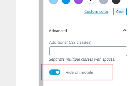
The input will now update our custom attribute hideOnMobile. The last step is to do something depending on the value of this attribute. As of right now, the attribute is saved, but not actually affecting anything.
Add a custom class
The final step is adding a custom class onto the block’s class. We do this with the filter blocks.getSaveContent.extraProps. This filter affects the props to the block’s save component. One of them is the prop className, which will always be applied to the frontend. We simply append our custom class after it if the attribute was true, and then return it. I’ve decided to add a class ‘hide-on-mobile‘, but you can call it whatever you’d like.
function coverApplyExtraClass(extraProps, blockType, attributes) {
	const { hideOnMobile } = attributes;

	if (typeof hideOnMobile !== 'undefined' && hideOnMobile) {
		extraProps.className = extraProps.className + ' hide-on-mobile';
	}
	return extraProps;
}

wp.hooks.addFilter(
	'blocks.getSaveContent.extraProps',
	'awp/cover-apply-class',
	coverApplyExtraClass
);
This code is pretty self-explanatory. At line #4 we check if the attribute hideOnMobile exists and is true. If so, we append a custom class to the className string.
With all of the above three filters, we should now get a custom class ‘hide-on-mobile’ applied to our Cover block whenever the setting is toggled on.

All that remains is to add some CSS to your theme’s frontend stylesheet. Something like this;
.wp-block-cover.hide-on-mobile { display: none; }
@media (min-width: 480px) {
	.wp-block-cover.hide-on-mobile { display: block; }
}
Example 2: Add Inspector panel with custom background color setting for Spacer block
For the second use-case we want to add custom color settings to the Spacer block. As default the Spacer block has no other settings other than its height. Let’s assume we want to add a background color that colorize the Spacer block’s full height. That allows the user to add empty, colored “stripes” inside their content. In this case we want to add the color settings in its own separate panel in Inspector, as per usual expected behaviour for color settings.
Note: Handling colors is a little bit more complicated as we need to use a(nother) higher-order-component withColors. Because we already need to implement a higher-order-component in the editor.BlockEdit we need to compose multiple components. Additionally we need to add two attributes for each color setting. One will contain the color palette’s slug, and the other will contain the hex color code – only if the user has opted for a custom color (used the colorpicker). This is all common behaviour when working with withColors. I have a post that explains adding color settings and withColors in detail if you get confused.
Secondly we will in this case run into the issue explained above; where we can’t add the appropiate inline style to the editor. The solution I’ve opted for in this case is to wrap the Spacer block inside a div in the editor, and apply the proper classes and inline style to the wrapping div. This makes the selected color visible in the editor when the block is unselected. Upon selecting the block however, WordPress adds its own custom light-gray background to the block, covering our custom background color. One CSS to the editor will fix this. I’ll explain more at the end.
The steps are the same as the example above. We enqueue our script to the editor in PHP first. Then in Javascript we filter the attributes object, the Spacer’s edit component and finally the Spacer’s save component.
Adding our script to the editor
We hook a function onto the action enqueue_block_editor_assets. Inside our function we enqueue a script, just like we would usually do in wp_enqueue_scripts hook.
add_action('enqueue_block_editor_assets', function() {
	wp_enqueue_script('awp-gutenberg-filters', get_template_directory_uri() . '/assets/js/gutenberg-filters.js', ['wp-edit-post']);
});
Remember to adjust the path to your script. I like to add ‘wp-edit-post‘ as a dependency to the script to ensure it loads late enough.
That’s all of the PHP we need to do. The rest is written in our Javascript file.
Add custom attributes
Like in the example above we add a filter on blocks.registerBlockType in order to add additional object items to the block’s attributes object.
When working with withColors we need to add two attributes for each color. The name of our background color attribute is backgroundColor, which means the second attribute must be named customBackgroundColor. This is all explained in my post about handling color settings in Gutenberg. Both should be of type string, and only applied to blocks of type Spacer.
function addSpacerAttributes(settings, name) {
	if (typeof settings.attributes !== 'undefined') {
		if (name == 'core/spacer') {
			settings.attributes = Object.assign(settings.attributes, {
				backgroundColor: {
					type: 'string',
				},
				customBackgroundColor: {
					type: 'string'
				}
			});
		}
	}
	return settings;
}

wp.hooks.addFilter(
	'blocks.registerBlockType',
	'awp/spacer-background-attribute',
	addSpacerAttributes
);
Add ColorSettings panel to Inspector
The second step is adding a color settings panel to the Inspector for the Spacer block by filtering editor.BlockEdit.
const spacerInspectorControls = wp.compose.compose(

	wp.blockEditor.withColors({backgroundColor: 'background-color'}),

	wp.compose.createHigherOrderComponent((BlockEdit) => {
		return (props) => {

			if (props.name !== 'core/spacer') {
				return(<BlockEdit {...props} />);
			}

			const { Fragment } = wp.element;
			const { InspectorControls, PanelColorSettings } = wp.blockEditor;
			const { attributes, setAttributes, isSelected } = props;
			const { backgroundColor, setBackgroundColor } = props;

			let newClassName = (attributes.className != undefined) ? attributes.className : '';
			let newStyles = {...props.style};
			if (backgroundColor != undefined) {
				if (backgroundColor.class == undefined) {
					newStyles.backgroundColor = backgroundColor.color;
				} else {
					newClassName += ' ' + backgroundColor.class;
				}
			}

			const newProps = {
				...props,
				attributes: {
					...attributes,
					className: newClassName
				},
				style: newStyles
			}

			return (
				<Fragment>
					<div style={newStyles} className={newClassName}>
						<BlockEdit {...newProps} />
						{isSelected && (props.name == 'core/spacer') &&
							<InspectorControls>
								<PanelColorSettings
									title={wp.i18n.__('Color Settings', 'awp')}
									colorSettings={[
										{
											value: backgroundColor.color,
											onChange: setBackgroundColor,
											label: wp.i18n.__('Background color', 'awp')
										}
									]}
								/>
							</InspectorControls>
						}
					</div>
				</Fragment>
			);
		};
}, 'spacerInspectorControls'));

wp.hooks.addFilter(
	'editor.BlockEdit',
	'awp/spacer-inspector-control',
	spacerInspectorControls
);
We need to use compose to combine the higher-order-component returned from this filter and withColors. In other words, we simply wrap the returned component in withColors. As parameter to withColors we provide our attribute backgroundColor.
Inside the wrapped component we make sure to always return BlockEdit (line #9 and #39 for Spacer blocks). For block of type Spacer we also hook onto InspectorControls to add a PanelColorSettings for our color choice. This is standard procedure of adding color settings.
At line #17 - 34 we manually generate the necessary class and/or inline style. Then at line #38 we add a wrapping div around BlockEdit with those classes and inline styles.
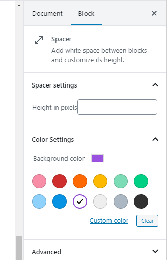
The result is a new color settings panel in Inspector for Spacer blocks, fully functional.
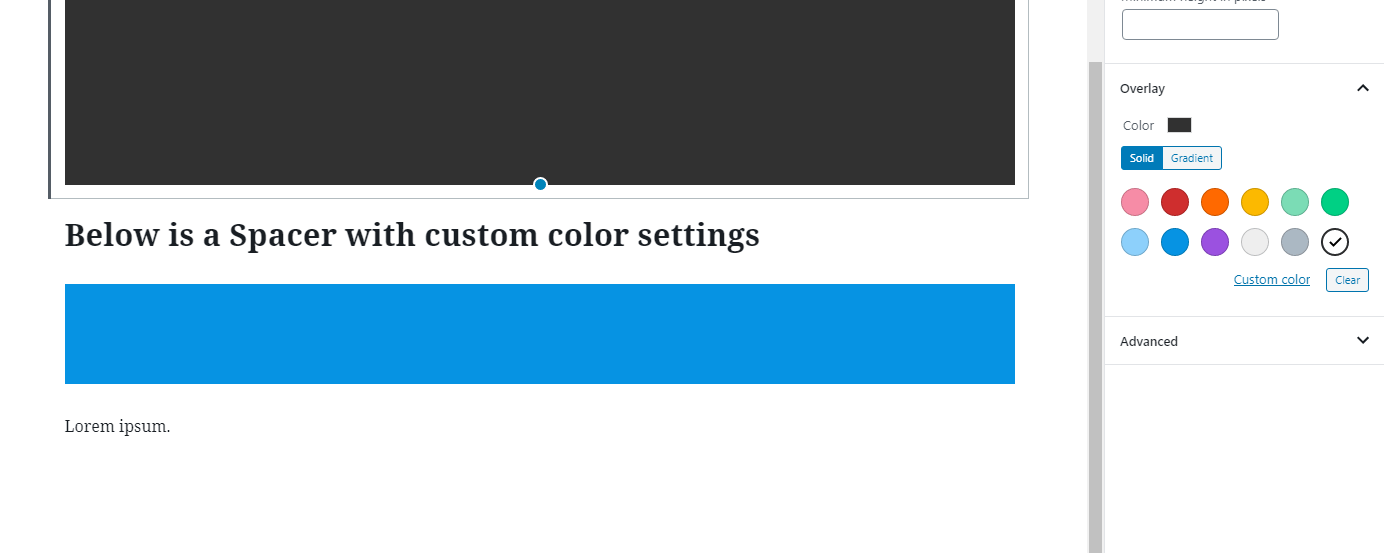
Choosing a palette color or a custom color will indeed be affected in the wrapping div inside the editor. But you can only see it when you deselect the Spacer block!
This happens because WordPress applies its own styling for when selecting a spacer block. We will fix it at the end, first we just need to apply the same class and/or inline style in frontend as well.
Add custom class and inline style to save
Finally we need to filter blocks.getSaveContent.extraProps and apply the necessary class and/or inline styling for frontend. Again this is very similar to what we did in example 1 above. If a palette color was chosen we need to add a class name that follows WordPress’ standards for color settings (“has-<PALETTESLUG>-background-color“). If a custom color was chosen we need to add inline style with the hex color.
Note: If you need to handle class names a lot I recommend importing the classnames library. This is heavily utilized in Gutenberg because it simplifies setting the proper class names by a whole lot. The code below assumes you haven’t and composes the class name manually.
function applySpacerBackground(props, blockType, attributes) {
	if (blockType.name == 'core/spacer') {
		const { backgroundColor, customBackgroundColor } = attributes;

		// For improved class name handling, use classnames library. Or do it manually like..
		let className = (props.className != undefined) ? props.className : '';
		if (backgroundColor != undefined) {
			className += ' has-' + backgroundColor + '-background-color';
		}
		props.className = className;
		if (customBackgroundColor != undefined) {
			Object.assign(props, { style: { ...props.style, backgroundColor: customBackgroundColor }});
		}
	}
	return props;
}

wp.hooks.addFilter(
	'blocks.getSaveContent.extraProps',
	'awp/spacer-apply-class',
	applySpacerBackground
);
With the above code, frontend will now perfectly render Spacer blocks with our custom color choice!
The final (optional) fix is to add some CSS to the editor. You’ll need to either add inline CSS or an editor stylesheet. For example you could enqueue a stylesheet in the same PHP hook we used to enqueue our Javascript file. I won’t go into detail about how to do this; but the CSS you’ll need is something like the below. All it does is set the Spacer’s background-color to the inherited color (it will inherit from our wrapping div) when the block is selected:
.block-library-spacer__resize-container.is-selected {
	background-color: inherit;
}
PS: Keep in mind that this is subject to change in the future. Gutenberg is still heavily evolving.
Conclusion
In this post we’ve learned two methods of implementing custom settings to existing WordPress Gutenberg blocks. It is fully possible for simple settings that perhaps only requires a class or inline styling. We’ve looked at the caveats, which I hope will be fixed in later Gutenberg versions!